")
GDC 2015 talk – The Gamer’s Brain
I’m sharing here my slides from my GDC 2015 presentation on video game UX (user experience). Since I didn’t find any good slide sharing plugin (speaking of bad UX…) I just added all the slides in jpeg and put my speaker notes below. 😉

User Experience in the gaming industry is getting trendy. So are Psychology and neuroscience. But what does it mean really? how to do it right? Where to start? How to know when progress is made? What is the key brain knowledge that you really need and that you can apply to your game? And most of all, why does it matter? Why knowing about the brain can help you develop video games when, for many of you, you’ve been doing it for years?

Before we get into the depth of the subject, let’s look at a classic task in psychology (Wason, 1966) , designed to understand how the brain reasons. Here above are 4 cards. Each of them has a letter on one side and a number on the other side. 2 of these cards are shown with the letter side up, and two with the number side up.
Which card(s) do you need to turn over to determine whether the following claim is true: “If the card has a A on one side, then it has a 3 on the other side”.
Try to think about this task a little bit.
….
….
I’ll wait … 😉
So what do you say? A and 3? Only A?

In deductive reasoning, an argument is invalid if the premise is true (in this case: A) but the conclusion is false (not 3). You need to turn over A to verify that a 3 is on the other side. You do not need to turn over 3, as even if we find another letter behind it, it won’t invalidate the argument. The same way that you do not need to turn over C. Lastly, you need to turn over 7, to verify that there’s not an A behind it, because then it would invalidate the argument.
In Wason’s study, not even 10% of subjects found the correct solution even though we all believe we have good logical skills. And this is not because the brain is stupid or not logical. The brain has evolved to recognize patterns and find shortcuts; that’s why we have survived so far. After all, the brain is very efficient for everyday tasks. And the mistakes the brain makes are insignificant tradeoffs in the scale of evolution.
However, as a game developer, this raises difficulties you must take into account if you want people to have a great experience playing your game. This is why you need to understand the gamer’s brain, and your own. That’s what this talk is about. Not telling game devs how to do their job. You know that already. It’s about using neuroscience knowledge and user research methodology to constantly making you aware of all these biases so you can make the best decisions for your game.

You have to keep in mind that there’s only so much workload the brain will tolerate: the brain consumes 20% of the body’s energy although it makes up only 2% of a person’s weight.
So the workload in your game must be dedicated to the core experience you want to offer, not in figuring out menus for example, or icons. That’s why defining your core pillars and sticking to this vision is crucial to offer a great User Experience (UX). There are always tradeoffs to make, and perfection is hardly reachable. UX is about making sure the tradeoffs make sense for the experience you intend.
That doesn’t mean your game must not be difficult or not have any challenges, quite the contrary: but the challenges must be about the core experience and nothing else. Think of it as Playing golf with green ball. Might be spicing it up for some hardcore golfers maybe?, but the golf experience is not about making it challenging to find the ball.
Here I propose to talk about 3 important things you need to know about the brain that can help you on a daily basis: perception, attention, memory.

Whatever you do – watching a movie, listening to music, playing a video game – your brain learns, makes new or reinforce synaptic connections.
Anything the brain processes and learns come from an input and changes the memory of a subject. And the quality of the processing depends highly on the attentional resources applied, which are also dependent on the emotions and motivation felt (although I won’t really have the time to address emotions/motivation here).
Disclaimer! This is highly simplified! And merely an overview with a few examples. Making games is very complex, so is the brain.
For communication sake (and the sake of our often tired brains) I’ll just, for each bucket, explain how it works in a nutshell, point out the main limitations, and give an example of how this knowledge applies to games.
Let’s start with perception.

Perception is not a passive window to the world.
The process can be bottom-up (sensation – perception – cognition) but it actually is top-down very often: your knowledge influences the way you perceive things (this principle is at the basis of Gestalt theory of perception).
Here below is an example:

What do you perceive here? Color stripes? or Street Fighter characters?
People who don’t know about Street Fighter might just see color stripes here. If you’re a fan of the game, you might see something different. And here we are likely all game developers and/or geeks, so a fairly homogeneous and niche crowd. Yet we perceive this image differently.
That’s why it’s important to know your audience, their prior knowledge and expectations, and make sure that what they perceive if actually what you intended. And just like the black and blue dress, different people perceive reality differently, because perception is a product of the brain.
Also, if you’re colorblind, you don’t give a shit about this slide. About 10% of people have some sort of colorblindness and they won’t perceive this image the same way other people do. Perception is subjective.

OK, so perception is a product of the brain. Here is an example of how you can use that knowledge to make your HUD/menus easier for the brain to perceive. By applying Gestalt principles (this is just one example).
One of these is the law of proximity. Objects that are near one another in space or time are perceived as belonging together. That’s why we easily associate the number 6 in the example above with the sword icon, because they are close to each other than other items in the HUD. Another law is the law of similarity. Objects with similar attributes are perceived as belonging together. That’s why we can easily understand what elements go together on the minimap, based on the colors and shapes.

Let’s take an example of dos and donts in Far Cry 4 skill tree UI. And before I go on with that, just a precision here: it’s easy to point out issues after the fact, and I only take that example because I played a lot of that great game and it illustrates my point in a great way.
Good:
- Items in the green boxes perceived as grouped correctly, using the law of proximity.
- Skill cost and skill point seen as similar using the law of similarity.
- Tiger vs. Elephant using both laws of similarity (color) and proximity (each on one side) to be discriminated.
Less good:
- Karma point symbol and progression bar: law of similarity ok (same color) but the diamond is as far from the box than the skill points (law of proximity broken).
- Within the skill tree, icons can be initially read as being organized in columns, instead of lines, because they are closer to each other on the vertical axis (despite the arrows).
- Lastly, the menu bar is very close to both the top right bar and the skill tree title, which makes it more difficult to read at first.

Let’s see how to easily improve the skill tree UI in FC4 by using the Gestalt law of proximity.
Let’s reproduce the icon placement here. Let’s not forget the little arrows, hard to see in the original version. You can see that it can be difficult to perceive this as lines rather than columns.

Now look at this. By using the same space and applying the Gestalt law of proximity:
- You place the icons on the horizontal line close to each other
- You make the icons have a shape that infers movement towards the right
- And you don’t need the arrows anymore
Easy, right? 🙂
Unfortunately, low hanging fruits are often scarce in our industry… Let’s keep moving to tackle another very important “law” of perception: Form Follows Function.

Form Follows Function is really important in design. Ideally, you reach affordance = What you see is how it works. Because the less info your audience will have to remember (about things that are not central to the experience you want to offer) the better. And if an icon or an item doesn’t speak by itself, then the player first has to figure out what it means, then remember it. Which won’t be the case if you can reach affordance (less workload)
It’s very hard to design icons, and in RPG games you need a ton of them, to convey abilities that are not obvious. Ideally you want the form of your icons to naturally convey its function, and in the same way for the majority of your audience. You also want to avoid multistability (or ambiguity).
Yes, people can eventually figure it out, but for every little piece that needs to be learned, it takes some workload that could be used for something else. And what needs to be learned will need to be remembered.

Unless your game is all about playing with perception (e.g. Monument Valley), you want your input to be perceived easily and understood as designed.
iPhone is still using icons representing a stereotyped mental model we have for email and camera. Even though it’s not really what these things look like today. Same thing with the telephone icon. The phones we have don`t look like the stereotyped phone icon. So the Form you choose might not exactly be true to the reality, but rather true to the mental model people have.
Seems easy and common knowledge but look at the Photos and Game Center icons: this time it’s totally abstract so users have to learn and remember them. Also, these icons are very similar too each other, as well as the Music and iTunes Store ones, although have different functions. Which makes it hard to differentiate.

So follow the FFF rule as much as possible to design your icons, to maximize icons that are self-explanatory and don’t need to be learned and memorized. And test them.
Here is how I’ve been doing it lately and I will take an example from Fortnite. Fortnite is an action/building game with RPG elements. So we have a lot of icons, like for class abilities for example. DISCLAIMER: Fortnite is, at the time of this presentation, very early in development (pre alpha) – most screenshots and footage are from UX testing (so low resolution) and many bugs or glitches are present in our UI.
We regularly take a list of icons and we ask our audience (or you can start by internal people that have never seen the icons before) about their form and function.

To explain what you want from your participants, give an example in the first page of your survey “Here’s is an example of an icon. For each icon you need to describe what does it look like (its form) and also what you believe it does in the game (its function). In the example, the form of the icon is a heart with an EKG graph inside and for the function it could be “I expect using this ability would resuscitate my character”.
Have one icon per survey page, and make sure the order is randomized. Also make sure that the icons are about the size it will be in the game.
It’s important to do this with a population sample that represents your core audience. There might be cultural differences for example (West vs Asia). Again, that’s why it’s important to define who your core audience is, as some codifications might work with hardcore gamers but not with casual ones, although genre is usually what defines common knowledge (RPG vs. FPS vs. puzzle games, etc.). Remember the Street Fighter color stripes. It’s not necessarily about your gender, age, or nationality; it’s more about common references.
Your ideal sample size for testing the icons would be 96-100, but let’s face it, most of us can’t access that many people so half of them (43) can give you good enough insight without increasing too much your margin of error. If you’re short on time and resources, test with less people anyway, it’s still valuable. Just make sure the people you are asking know about the genre and that they haven’t seen the icons before, as you want to test how intuitive they are our of context.

Before you analyze the results, it’s important that you ask the designer who designed the icons to answer the survey. This will highlight even more the difference in perspectives (designer vs. player) when it happens. Let’s look at the smoke bomb example (only showing partial results here to make it easier to look at). In this case, the icon can be tweaked. It seems that only the smoke part is not understood so it can easily be corrected.

In this other example (matter collector), the form of the icon is understood, but the function not at all. This is an example where your icon is not illustrating what you thought it would.
The function of this icon is very hard to convey though (it’s often the case with ability icons). So the designer tried something (of course he didn’t have high hopes but it’s also good to try). The idea behind the clock is that you gain time harvesting resources vs. if you manually break all the stuff. But people usually have a very different perspective about a clock. At that point, you have to change the icon completely, not just tweak it.
And you might need to use an abstract icon if the function is too complex, so at least it’s not misleading.

Reality of your assets is not what is important. What is important is how it’s perceived by the majority of your audience.
Let’s take an audio example: listen to the batcycke from The Dark Knight (here at 2:10 https://www.youtube.com/watch?v=FPaTv98wUsE). Sounds like it’s infinitely rising, right?
The reality (overlapping tones fading in at one end of the cycle and fading out at the other) is very different from what we hear (infinitely rising). It’s called Shepard tones (from Roger Shepard, 1964). You can watch the video here: https://www.youtube.com/watch?v=UXlR4wH971g
It was also used in Super Mario 64 when you try to reach Bowser before having 70 stars https://www.youtube.com/watch?v=B-udfiFZcko.

When you test your game, be careful when asking the players about their perceptions. For example, many players were perceiving the zombies in Fortnite difficult to aim at, and the overall impression they had was either because the zombies where too small or moving too fast.
The animation team was wondering what was really causing issues players were having to target the enemies. To test this question, we created a gym level about a shooting range. It allowed us to test the variables in a standardized environment. The participants were told to do as many headshots they could in one minute, as the husks were auto spawning.
This is how we saw that the problem was not an animation one, nor a character size one, but was mainly due to the pathing code (rotational value). It’s when zombies go around an obstacle that it becomes very challenging to follow them, because they do an instantaneous turn instead of a soft blend.
Analyze what people are saying, don’t necessarily take it for granted. Then make hypotheses and test them by controlling all other variables to find out what’s really going on.


Let’s now talk about memory.

Here is how memory works, in a simplified version.

The forgetting curve is about long-term memory, how things that don’t have much meaning or emotions fade in our brains (because of the neuronal darwinism law: survival of the fittest synapses). Players are likely to forget a lot of stuff in your game, especially since there’s an unknown time lag between 2 game sessions (we’ll look into that in a minute).

But first, do you remember the iOS icons I showed you earlier? Hopefully, you did remember all of them. You are likely already familiar with these icons, and I made you process this information.
However, I didn’t show you the telephone icon, but the camera one. I only talked about the phone one. Did you catch that? Because the brain is also good at making up false memories.
And can you tell for sure which icon is the iTune store and which is Music?

Because players won’t remember everything, there are some tradeoffs. As a designer, it’s your role to define what we need to focus on.
For example, in Assassin’s Creed, the designers decided that they did not want the players to remember the controls, so they are always shown in the HUD (see the slide below).

If you look at the top right, you’ll see that the mapping of the controls match the PS/Xbox controller, and it’s always displayed on screen, and contextual. Therefore, there’s no need to remember this.

Here’s an example from Fortnite, where the search key is always displayed when in reach of a searchable object.

But beyond these obvious visual cues, prioritizing the learning is crucial for your game. So you can decide what you truly want the player to remember. Here is how we started doing it on Fortnite. Fortnite is an action/building game with RPG elements. You are the Commander of your Homebase: by growing your Homebase you unlock buffs and hero classes, and you send your heroes out on missions. During missions, you scavenge for resources, craft items, build defenses, then combat zombies (named husks).

To put together the onboarding plan, I asked the designers to list all the things the player has to learn in the game and to prioritize what are the most important things for Fortnite. You’ll end up with a massive list, but here I’m only gonna show you some of the most important features for Fortnite.
Once you have the list, you ask the designers to prioritize it regarding the game pillars. Then define the order in which these tutorials have to be taught and the level of depth needed to teach them.
For example, ‘teach core movement and combat’ is very important, but is something that is usually picked up naturally by gamers. So it’s gonna be taught early but only through a dynamic tutorial text (you won’t see the tips about WASD if you already started to move). There’s no need for deeper teaching for that element.
Building on the other hand is something really important in the game (it’s one of the pillars) but it’s harder to pick up. So once you established these elements, you end up with a tutorial order that helps you rearrange the list.

Once the list is in order, you have to decide what’s the onboarding plan. And for each feature you need to adopt the players’ perspective and understand why learning this element is important to them. And you do that for every feature of the game. This methodology will allow you to make faster decisions and build hypotheses about the game and its experience that you will be able to test with playtest and analytics.
The last thing you do is building the narrative that will bring all the pieces together. If you start with the narrative (which is tempting as we all love stories) you will take the risk of needing to adjust your onboarding to the narrative which could hurt the experience of the game. Narrative should be at the service of gameplay, and should transcend the onboarding plan. Now, of course, if your game experience is all about narrative, that’s a different story…

Here’s an example of how this process helped us to make a faster decision regarding the feature order in our early onboarding process.
HomeBase is the player’s persona in the game, what they grow, what is persistent. So it’s a very important feature. That’s why we decided – so far – to go with Homebase first, as fast as possible, so at least the expectations are set correctly for the player. We know we’re making trade-offs here, but it’s really important for our experience that players identify themselves to their Homebase as soon as possible. We decided to do it very quickly – 3 minutes top – and basically show the players a base they can expand now that it’s theirs, so they have to name it, choose a banner, then start a mission to gain rewards to start growing their base.
Prioritizing the learning means you have to define what tradeoffs are the least damageable to the experience you want to offer. Because there are no perfect solutions.

Then, to verify if players got our intentions, we ask questions about their perceptions after gameplay, but in a way it can validate or invalidate our hypothesis. Since our goal is to make Homebase meaningful, some questions are meant to find out if this is how their perceived Homebase. Of course, the order of these questions is randomly generated… We also asked questions right after the first mission, to check if they understood the concept of Homebase (at its core, not in detail at that point).

And we went on with all the features. For example, do we need to teach about scavenging? All players in our ux tests so far (including 13-year olds) immediately started destroying stuff with the stick, so it was not essential to have a proper tutorial for that. On the other hand, many players in tests were not seen crafting guns or making doors soon enough, so we did tutorials for these mechanics since the game loses its fun when you don’t know how to do that.
Will show more examples from Fortnite crafting/building later in the presentation.


Lastly, let’s talk about attentional resources.
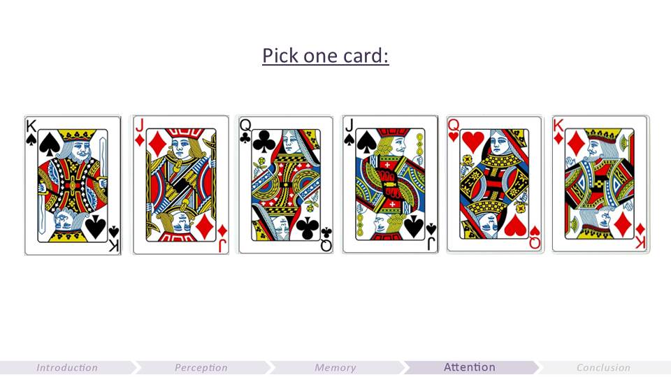
Pick one card and remember it.
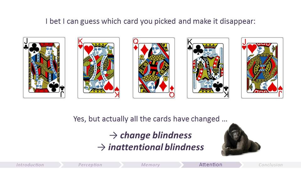
Magicians know very well how to trick our attention…
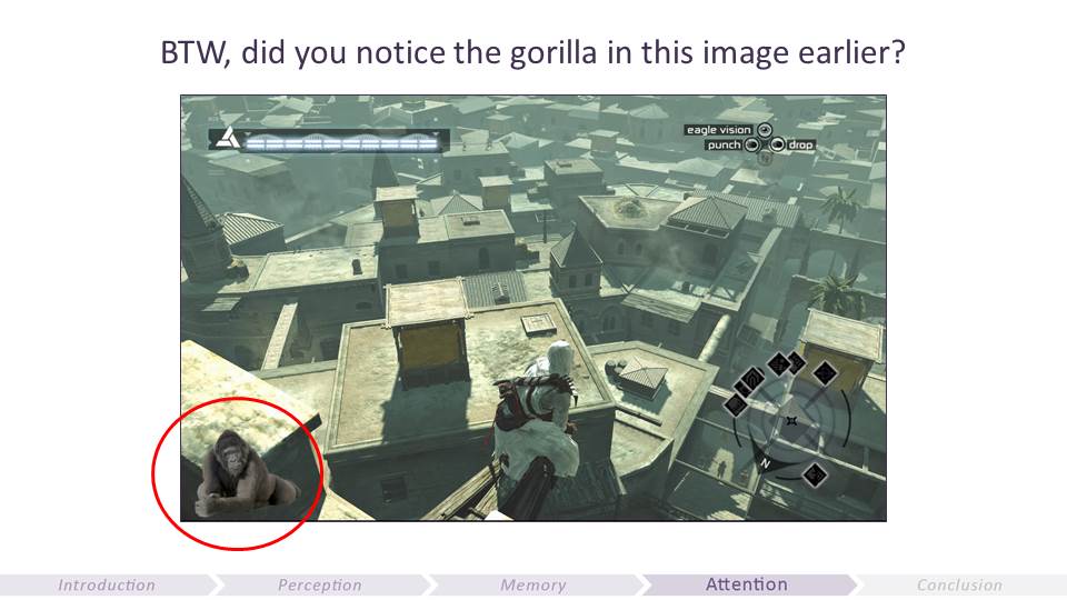
Change blindness is the failure to notice an obvious change. Inattentional blindness is the failure to notice the existence of an unexpected item
So you have to find a way to ensure you have the player’s attention if you’re conveying an important information.

We need to make sure that the player is not overwhelmed by multiple inputs, and draw his/her attention to the important info you want to convey.

Multitasking is a myth and it’s actually not that simple to draw the player’s attention to something. However, when you learn, attention is a key component to successful encoding. So you have to find a way to ensure you have the player’s attention if you’re conveying an important information.

Even though a lot of people now understand that multitasking is a myth, there are still a lot of games that fire multiple inputs at the same time; like in games when a NPC is talking to you while you learn how to drive a car for example. Here is an example in Fortnite onboarding. There’s a tutorial text about health regen that pops up at a moment when the player is obviously busy dealing with enemies. That’s not when the brain has enough attentional resources to learn new things (or even perceive a pop-up window).
True, the good thing is that we’re trying to teach at a meaningful moment, but it’s actually not a good call to try to draw player’s attention when under threat. Right after (still meaningful and the player can actually pay attention and do it) in the way to go.

Red is a great color to use to draw attention. Especially in the West to draw attention to dangerous/critical things (getting hurt, critical health, etc.). The problem is that red is often over used. And when that happens, it loses its attention-drawing advantages (if too many things are red, then a red element stops to stand out).
As we are developing the new Unreal Tournament, we did a UX test on UT3 to check the problems the game had then to not do the same mistakes. Turns out that there’s a huge red overload when you’re on the red team. It’s harder then to spot the red feedback telling you’re getting hurt and need to react. Many PvP games have blue vs. red teams and gamers usually like this convention. However, most of them don’t realize the red team is disadvantaged versus the blue team. Actually, analytics on Gear of War 3 showed that the blue team overall had 5% better win rate than the red team (sadly I don’t have the data anymore).
Best scenario would be to always be on the blue team and the enemy team to be orange (not red, so red can be saved for critical events).

On Fortnite, we used to have the enemy bars in red and the red damage feedback was too far away from reticule.
We removed nearly all red signs and feedback except for critical info for the player (getting hurt and from where) and we put the red feedback on getting hurt closer to the reticule, where attention usually is. The enemy bar is now orange. And we saw unnoticed death rate getting much lower. Again, this is just about adding clarity in the UI to reduce the attention workload. Think about playing with a green golf ball…
Prioritize what is important for the experience and remove all potential friction points. And think about your worst-case scenario. Sure, it might not feel like red overload with 1-2 enemies, but it could later in game when it’s getting super challenging.

People learn and remember better what is meaningful to them, and emotional.

Of course early on you use whatever is already in your game to start building the onboarding, that’s why even though you know it’s not gonna work great, you do whatever you can at the development stage you are.
If you have your hypotheses ready, you will actually gain much more insight from the early playtests, which will allow you to improve the game faster and better.


The brain is extremely good at very quickly making sense of the world with little information. That’s how we survived our predators. So all the mistakes the brain makes are insignificant tradeoffs in the scale of evolution.
However, it can help you gain precious time and avoid great caveats if you are aware of the brain limitations (and can remember all of them).
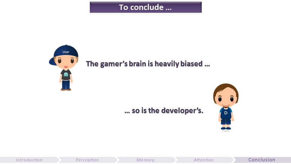
The problem with the brain is that not only it’s heavily biased, but we strongly believe it’s not the case.
We believe our senses are accurately conveying reality when in fact what we perceive is a construction of our brains.
We believe we have a good memory when research shows that we can easily forget and even that we are very prone to false memories.
We believe we can efficiently multitask when research shows we actually suck at it.
Most gamers will say the HUD in your game is clear, but then they will fail to explain it accurately when asked to describe it.
You might believe you have a great design intuition. But are you sure you can rely on it? And what about when different people of your team have different opinions?

All of the brain limitations we talked about are at the core of UX heuristics, which you can use as a checklist to help you make faster and more enlightened decisions. Of course this is no precise science, as the brain is complex. And if there was a recipe for cooking great games, we would know about it and I would be out of job.
Heavily trained pilots use checklists too. It’s not because they aren’t good at their job, it’s because they know they cannot efficiently rely on their brains. Creating a video game is not as risky as piloting a plane, but it is nonetheless a very complex endeavor. Next time you’re flying, think about this.
I hope that you learned new things about the brain and that this will help you. I’d be very interested to get your feedback on all this.
Pingback: The Gamer's Brain, Part 2: UX of Onboarding and Player Engagement (GDC16) - Celia Hodent
Pingback: Mecánicas, game feel, experiencias y fun | Selitos
Pingback: Weekly #33 | na odwrót
Pingback: [GameDev] Tutorial cara membuat tutorial dari George Fan | Blog nya Enlik
Pingback: 5 Misconceptions about UX by Celia Hodent
Pingback: Three GDC 15 Talks on Psychology and Video Games | The Psychology of Video Games