These are the slides from my GDC 2016 presentation. This session is meant as a follow-up to my GDC 2015 talk about How Neuroscience and UX Can Impact Design (hence, “part 2”). Since it seemed to generate interest, I wanted to do a deeper dive on one of the critical aspects of a game’s user experience: the UX of onboarding and player engagement. You can watch the video of this presentation here.
As an introduction I will quickly reintroduce some neuroscience notions as well as UX notions that I tackled in Gamer’s Brain (part 1).

The user experience entails how a person perceives and interacts with a product and the satisfaction and emotions elicited via this interaction. It takes its roots in cognitive science, Human Factors, and Human-Computer Interaction (HCI). UX also designates an umbrella discipline whose objective is to evaluate and improve the experience of the targeted users of a product in development. It includes UX design, interaction design, user research, UX strategy, etc., although UX should be the concern of everyone on the team.
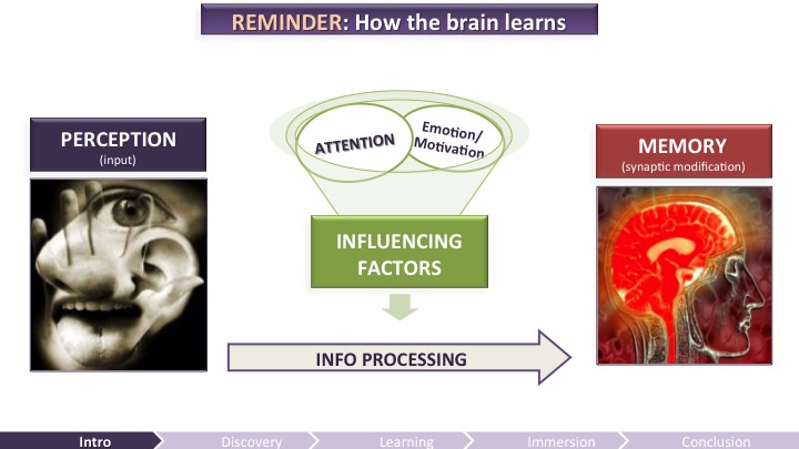
Discovering and mastering a video game is a learning experience for the user. It requires mental efforts. This is why it’s important to understand how the brain learns to craft a compelling onboarding experience – one worth putting effort into, one that will matter to your audience.
Anything the brain processes and learns originates from a perceived input and changes the memory of a subject. The quality of the processing – therefore the quality of the retention – depends highly on the attentional resources applied, which are also dependent on the emotions and motivation felt by the players. In sum, to improve the experience of the players, video game developers must take into account the perception, memory, and attention limitations of the brain, as well as the emotions and motivation felt by the players.
Disclaimer! This is highly simplified! The brain is even more complex than game development, so imagine the complexity we’re talking about….
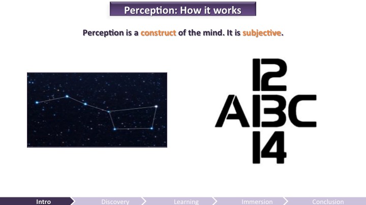
Perception involves all the mental processes that allow us to sense our environment and construct our own mental representations of it. Perception is not a passive window to the world; it is a construct of the mind into meaningful patterns. Perception is highly influenced by previous knowledge, expectations, or – like in this example – context: the input at the center can be perceived as a B or as a 13 depending on the context you read it.
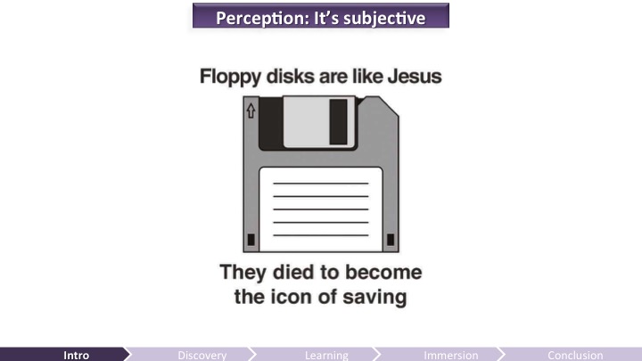
Another example illustrating that perception is subjective: contrary to older people like me, the save icon does not mean anything to the youngsters as they do not have a mental representation based of previous experience for this object from the past, until they learn what it symbolizes when using a computer. So designers have to keep in mind that what they perceive might not be what their audience will perceive.
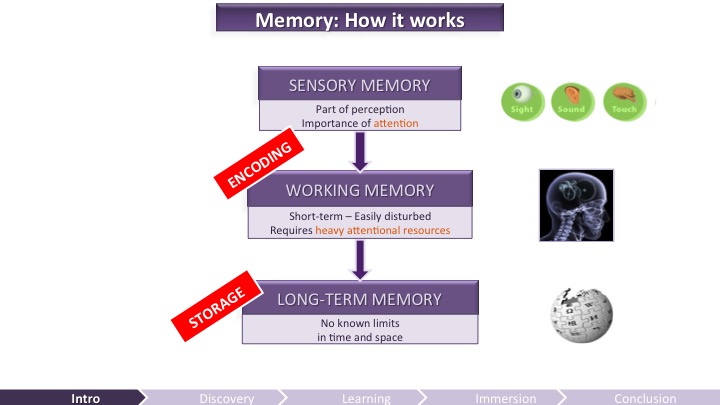
Memory allows us to encode, store, and retrieve information. There are three components of memory (Atkinson and Shiffrin, 1971; Baddeley, 1986):
- Sensory Memory: part of perception, it retains sensory information for a very short period of time (such as a fraction of a second) without it being consciously processed. For example, the persistence of vision is due to sensory memory and it allows us to perceive a 24-image-per-second display as an uninterrupted animation. It requires attention for the information to go to…
- Working Memory: it’s a short-term component that allows for temporary storage and manipulation of a very limited amount of new or already stored information. This system maintains active mental representation necessary to perform a task. The working memory requires heavy attentional resources and therefore is very limited. It’s also very easily disturbed.
- Long-Term Memory: multiple-system component that allows us to store knowledge of events and facts, as well as skills (know-how) and conditioned responses. The long-term memory has no known limits in space and it can potentially store information for a lifetime. However, memory lapses are fairly common.
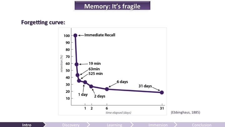
Talking about memory lapse, here’s the forgetting curve illustrating how memory retention declines exponentially with time (Ebbinghaus, 1885). Retention of information, especially if not engaging emotionally or meaningful, can be very fragile. Some variables have an impact on the strength and quality of the encoding and storage of information, such as the level of processing and the amount of repetition over time. Not only the brain is prone to memory lapses, but it can also distort memories. Because of these limitations, developers cannot rely too heavily on the players’ memory.
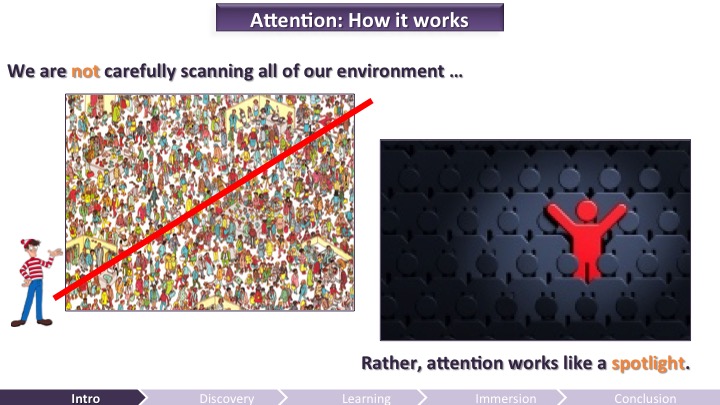
Our senses are continuously bombarded by multiple inputs from our environment. Attention entails allocating more cognitive resources to process selected inputs while the others will be ignored (selective attention). The brain’s attentional resources being very limited, we do not methodically process all the available information from the environment. Instead, attention works like a spotlight, focusing resources to process and retain particular elements and neglecting the other inputs (e.g. cocktail party effect – in a loud party, you can focus to listen one conversation by ignoring all the rest).
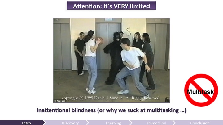
When elements are unattended they are likely not perceived at all, in a phenomenon called inattentional blindness (Mack and Rock, 1998). This phenomenon was best illustrated in the well-known “gorilla” experiment (Simons and Chabris, 1999) in which you have to count the basketball passes of the white team, leading you to need see the gorilla passing by.
Even though a lot of people now understand that multitasking is a myth, there are still a lot of games that fire multiple inputs at the same time during the onboarding; like in games when a NPC is talking to you while you learn how to drive a car for example.
When multitasking or cognitive overload occurs, it affects engagement, focus, and therefore hinders the quality of learning which can affect your player’s experience overall.
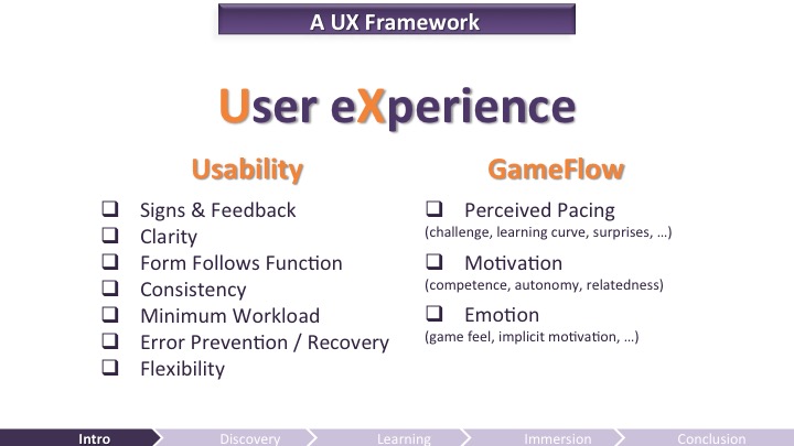
I ended my session last year showing some UX heuristics – or guidelines – from usability and from what I like to call GameFlow that can help you remember what elements are important to avoid confusing your players and to increase the fun potential of your game. Here, we are going to look more deeply into the onboarding, the first time user experience.
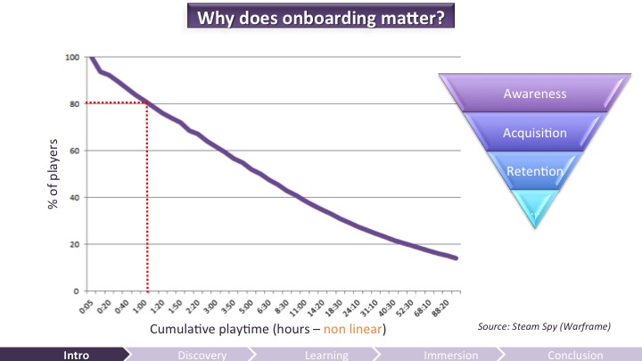
Why is onboarding important? Here’s a chart showing the cumulative playtime in Warframe (note that the data is compressed on the x axis, the hours are not linear). It shows that 80% of all players ever kept playing after one hour. Which means that in a free-to-play game (F2P) you will lose about 20% of your audience during the first time user experience, the “onboarding”. And Warframe is a successful F2P game, so imagine how this curve looks like for a less successful game (I didn’t want to point fingers just to show dramatic charts, so I encourage you to go to Steam Spy to figure it out by yourself if you haven’t done so already).
Engaging your audience within the first minutes of play is a delicate endeavor, and has become a critical aspect of development in the era of free-to-play games. If your game fails to captivate your audience’s attention quickly, there won’t even be any retention challenges to care about.
Don’t get me wrong, a great onboarding is not a guarantee for success. After this short-term engagement, mid and long-term engagement will be tremendously important too, but we are mainly going to focus on the first hour of play here.
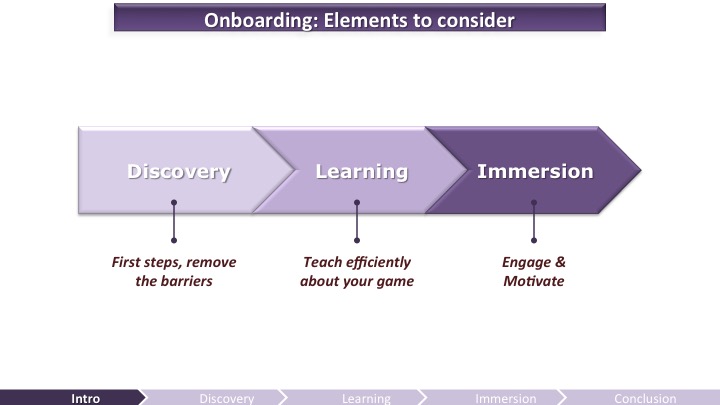
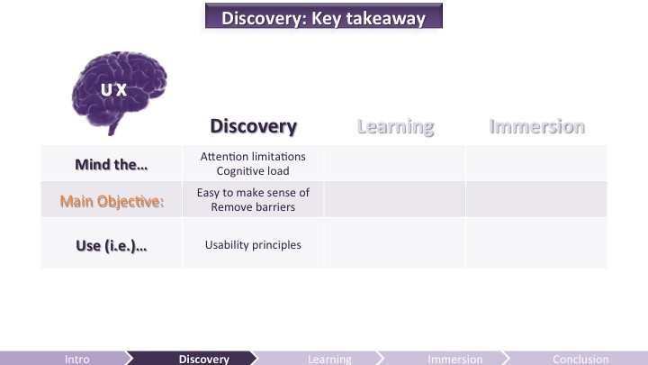
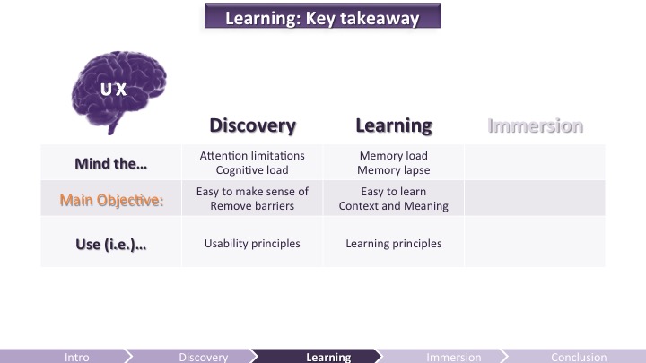
During the onboarding part of your game, you need to get your message right when the players are discovering the game, and remove barriers. Then, you’ll have to make sure players can quickly learn the main mechanics of your game, and engage them through clear goals and the progression path they need to take. Too often the transition from the “tutorial part” to the “real” game is not engaging because it lacks meaning.
These elements are not really separated and they’re not linear (only linear in this presentation): the player can discover, learn, and get immersed at any time, even long after the onboarding part. I also do not mean that you should not be preoccupied by motivation mechanisms during the discovery part (the very first steps), or that players cannot be immersed within the first few minutes of play. Learning is a central part of the onboarding here, but it happens in all these steps. Because playing a game is a learning experience. That’s why learning principles are going to be at the core of this presentation.
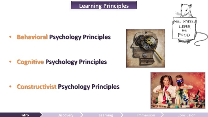
Developing effective materials that facilitate learning requires an understanding of the principles underlying how people learn (Alessi & Trollip 2001), which are:
- Behavioral Psychology Principles: it’s basically conditioning (which affects implicit memory) – Pavlov, Skinner, Thorndike, you know their names. They only looked at stimuli and responses (input/output) without bothering with what happens in the mind (the black box).
- Cognitive Psychology Principles: the dominance of behaviorism began to wane in the 70s and cognitive psychology took over. It wanted to look into the black box with an information-processing approach (perception, attention, memory). It also introduced the notion of an executive control.
- Constructivist Psychology Principles: Lastly, according to the constructivist viewpoint, learning is a process of people actively constructing knowledge (e.g. work of Jean Piaget, or Seymour Papert’s research with LOGO). This is about active learning.
These different learning principles will be used as perspectives throughout this presentation.
The first part of the talk will emphasize on one of the most important aspects of the brain with respect to onboarding: managing the player’s attention. Learning to play a new game necessitates a different cognitive effort than mastering a game. A new player is not necessarily deeply motivated to play and has many new things to understand, so the game must engage its audience quickly and efficiently. Every point of friction can turn the player away at that stage, especially with free-to-play games since they don’t require previous commitment (you don’t buy the game).
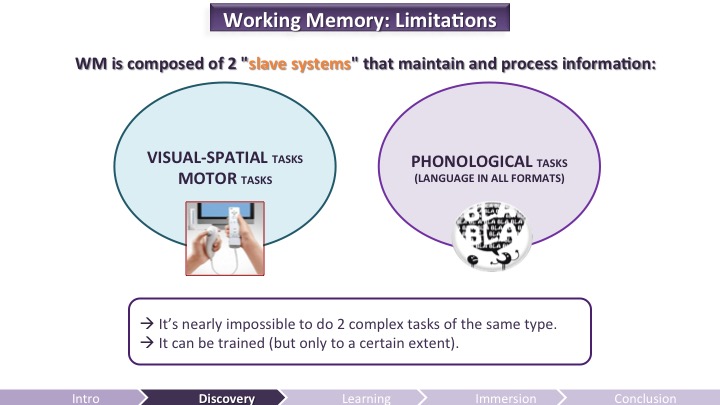
To remove barriers you need to manage the player’s attention. To do that, you need to understand how Working Memory works – the component that stores and manipulate information. It is composed of 2 main slave systems:
- One responsible for processing visual-spatial and motor tasks.
- Another responsible for processing phonological tasks.
If you try to accomplish two tasks that require the same sort of processing – say singing a song with lyrics while trying to identify verbs in a text (both phonological tasks) – it is very difficult, and you will likely do both tasks poorly. If you try to accomplish two tasks requiring different processing – say, singing a song with lyrics (phonological) while sketching (visual-motor) – it’s much easier although still usually not as efficient as doing one task only.
When attention is divided, for example when driving while having a conversion over the phone, it requires more cognitive load to process the different information, therefore leading to more fatigue and mistakes. The more demanding a specific task is in terms of cognitive load (e.g. complex mental calculation) the less people can allocate mental effort to accomplish another task, even though simple (such as pressing a button when a red light goes off; cf. Kahneman, 1973). Subsequently, the more attention is allocated to a task or information, the better it will be retained.
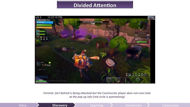
Here’s an example of divided attention from Fortnite (action-building game with RPG elements, currently in live alpha stage) – DISCLAIMER: images shown in this presentation come from UX testing: they are very compressed and showing a work-in-progress game.
In the video (which you can say in the GDC Vault if you have access), the player chose to play as Constructor, so his role is to stay close to the fortifications to repair them and reinforce them. However, he’s running around because, well, smashing zombies is fun. An important message popping at the top tells the player that the fort is being attacked and that he should go back to repair it, but the player does not even look at this info which is an important mechanic to be successful in the game. He is not dividing his attention because dealing with enemies is taking all his attentional resources, just like in the Gorilla experiment.
Thus, it is critical during the discovery part of the game to draw the players’ attention to the elements that they need to learn to enjoy their first steps. Given that all of our mental processes are using the same limited attentional resources, the developers must mind the cognitive load the game demands from the player, especially during the onboarding part, when the players have a lot of new information to process. It means prioritizing the learning and minding the pacing.
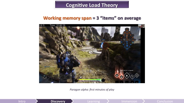
According to the Cognitive Load Theory, learning can be hindered if it requires cognitive resources exceeding the working-memory limits. The Working Memory span is about 5 “items” more or less 2, an “item” being an action or a thought process that requires effort.
I suggest you to remember that 3 items to process at the same time is THE MAXIMUM when in learning mode (discovering everything) because new tasks have a much higher cognitive load than familiar or automated ones (think about the efforts it took you to drive when you were first learning it versus now when you don’t even think about it). Once trained (later in the game), the cognitive load decreases but not when the player is acquiring new knowledge or skills.
3 items could be, for example: 1-using an ability to 2-react to enemy attack (analyzing enemy movement pattern) while 3- dodging enemy projectile. If the controls of your game are peculiar, that would count as another item.
During onboarding, minding the cognitive load is critical because the challenge will not be seen as mastery by the player, but annoyance or, worse, the player will be put in a failure condition. This is likely going to create stress – that can now be captured with biometrics tools – which can lead the player to simply stop playing (and blame it on a stupid game). So F2P games MUST mind the cognitive load in Working Memory.
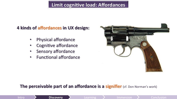
There are many ways to reduce the cognitive load, such as distribute learning over time, which we’re gonna see later. You can also use affordances to limit the cognitive load: what is intuitive does not need to be learned, therefore requires less attentional resources to process. In design, an affordance gives or provides something that helps a user do something (cf. Gibson, 1977; Hartson, 2003).
There are 4 kinds of affordances in ux design (I’ll give an example of each right after):
- Physical affordance: feature that helps users in doing a physical action in the interface. Example: a button that is large enough so that users can click on it accurately
- Cognitive affordance: feature that enables thinking, learning, understanding, and knowing about something. Example: a button label that helps users know what will happen if they click on it. Form Follows Function is a cognitive affordance.
- Sensory affordance: design feature that helps users sense something. Example: a label font size large enough to be discerned.
- Functional affordance: design feature that helps users accomplish a task. Example: sort functionality in an inventory.
There’s a subtlety: the perceivable part of an affordance is a signifier (cf. Norman, 2008). So as a designer you care about placing signifiers to enable the players to perceive the affordances.
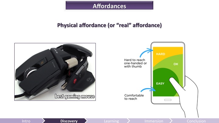
Physical affordance facilitates physically doing something. Such as a handle on a door physically helps operating the door. You want a button to be large enough to click, or two buttons not be too close to each other to avoid missclicks (see the Fitts’s law) or, on mobile, interactive areas to be comfortable to reach.
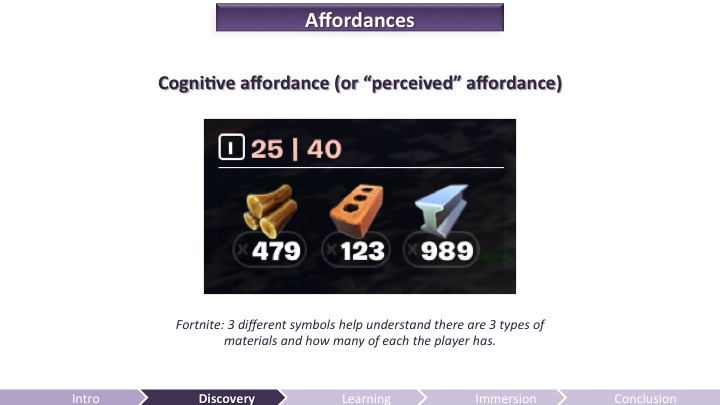
A cognitive affordance facilitates or enables thinking about something. They help users know what to do. A pull handle offers both cognitive and physical affordance because it provides a physical means for pulling as well as a visual indication that pulling is the required action. In Fortnite, there are 3 different symbols representing 3 types of materials and how many of each player has, which helps players understand what they can do with it.
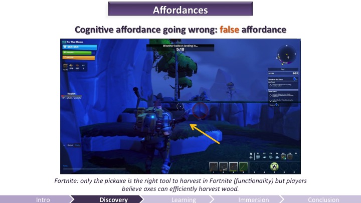
Cognitive affordances can go wrong. A false affordance is when the perceived affordance is not the one intended given the functionality. For example, in Fortnite you have one efficient tool for harvesting everything (including trees) – the pickax – and all other tools (sledgehammer, ax, sword, you name it) are only efficient for meleeing. However, an ax is a tool that we intuitively interpret as a perfect to chop off wood, therefore players were seen using the ax to harvest trees, even though we gave multiple feedback that it was not the right action to take. The false affordance was too strong to unlearn. (Note – Of course it wasn’t the design intention in the beginning: designers wanted specific tools to harvest specific resources but then found out that it was to arduous for the player, so they removed that mechanic and for a time got stuck with this false affordance problem that had a pretty deep impact on the enjoyment of the game). The only solution was to remove all the tools that created a too strong false affordance (bye-bye, ax!).
False cognitive affordances misinform and mislead the players, and then it makes it much harder to teach them the right thing, and it’s frustrating for the players on top of it. Make sure to track down and ruthlessly destroy all false affordances in your game.
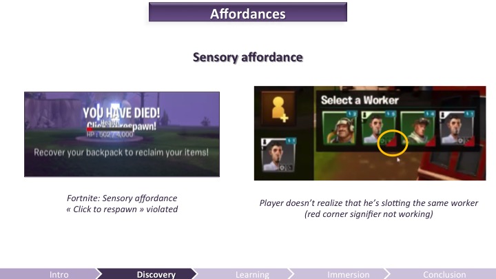
A sensory affordance helps players sensing something (e.g., seeing, hearing, feeling). This is what we call in game usability the perceptibility of signs and feedback. It includes noticeability, discernability, legibility (in the case of text), and audibility (in the case of sound).
You can slot workers in Fortnite Homebase buildings to increase your stats. When you click on the + button to slot a worker, it was showing the workers you could slot, including the ones already slotted elsewhere. Subtly indicated by that red corner mark (picture on the right). Of course, players didn’t see it and they were observed going back and forth between two buildings trying to slot a worker, not realizing they were actually slotting / unslotting the same one over and over.
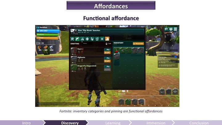
Functional affordance ties usage to usefulness. This is when you add a functionality, such as sorting in categories to help the player find more easily an item, filtering, and pinning to help the player craft something faster. Designers have to make sure the functional affordance really is going to be useful to the player, and not just add noise or complexity (c.f. Pareto principle – 80% of the time people use only 20% of the functionalities).
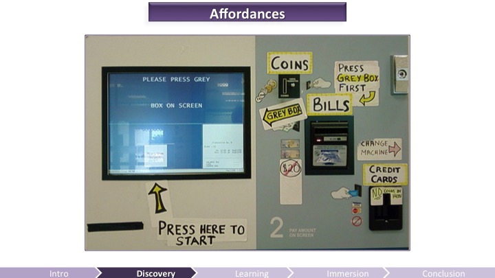
Some interfaces feel easy to use while others drive us nuts and require manuals or sticky notes to make sense of. It will greatly help remove barriers for your players’ first steps if your game has good affordances (or should I say, good signifiers). Because if it doesn’t, you’ll need tutorial texts or players will have to make an extra effort – which they often won’t – to figure out on forums how to use a certain functionality.
Although learning-by-doing is recognized as being one of the most efficient ways of learning – especially when it comes to an interactive experience – tutorial texts are still frequently used to teach the main components of a game.
Research suggests that we learn best when we are cognitively active and engaged, when learning experiences are meaningful and socially interactive, and when learning is guided by a specific goal. So let’s take a look at active tutorials.
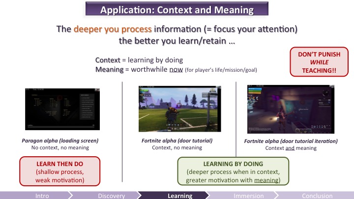
Yes, players say they hate tutorials but they still are more likely to retain if they understand and remember the basic mechanics of your game. When you simply give a text, it has no context or meaning, because the players cannot try the things you are telling them at the moment you are teaching them. Tutorial text on loading screens – although a good way to fill up the waiting time – will likely not be remembered well. When you teach the player something when they can actually do it, it gives context (learning by doing). But if on top of it you add meaning by giving a clear purpose for practicing that new skill, then players will retain even more.
Another thing to remember here: Avoid punishing states during onboarding. And I’m talking to you, Bloodborne and Dark Souls lovers out there: if it’s not clearly the main pillar of your game (punishment), you should never punish the players WHILE THEY ARE JUST LEARNING ABOUT SOMETHING (it’s okay to punish them later though, that’s part of the challenge, just don’t do it while in early-learning mode). Why? Because players who die or are having difficulties during the onboarding are less likely to retain (this is actually what we found out looking into analytics data from Fortnite’s alpha with our hardcore gamer population). Again, your hardcore players might complain if they find the game too easy in the beginning, still, they will more likely keep playing. So don’t get crazy with your difficulty curve, learning about the game is already challenging enough for the brain.
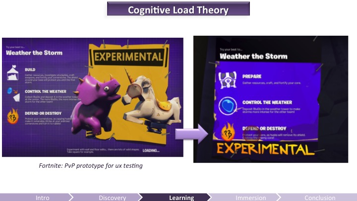
Sometimes you just cannot provide context. For example on loading screens. If you use loading screens to teach (which you should as empty loading screens make the waiting time appear longer), there are ways to make it easy on the cognitive load.
On the left you can see a picture of the first attempt at the loading screen for PvP in Fortnite: There was too much stuff to read and it was going too much into details that didn’t make sense to players who didn’t who anything about this mode. It was too much about the what, and not enough about the why/how. Players were actually looking more at the cool art. The next iteration (on the right) removed a bunch of text and simplified the first step (Prepare).
Because of the “curse of knowledge” we have a tendency to explain things we know well by getting too much into details, explaining more about how to do all the things, instead of minding the cognitive load of the player and the purpose of tutorial. So if you are using loading screens to convey tutorial text, don’t explain more than 3 things and focus on the why (main goals) rather than the how (to reach these goals) or the what (items in game you need to interact with).
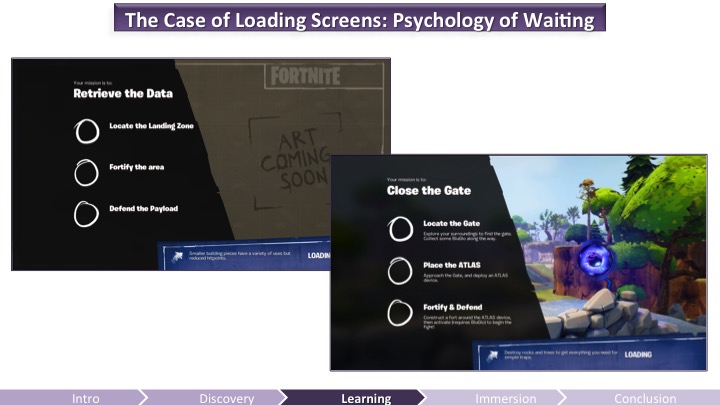
Using loading screens to occupy players is a good thing though, because waiting is painful. And it is also a matter of perception. For example, waiting times will seem shorter if:
- There is a progression bar that has animation on it.
- If this progress bar accelerates (rater than decelerates and stops).
- If players have something to do while waiting (instead of looking at an empty screen).
So use the loading screens to convey useful information but keep in mind that players WON’T read it if there’s too much information (or if they do read it, they won’t remember much of it). Remember the working memory limitations: try to stick with 3 elements to process and focus on the why.
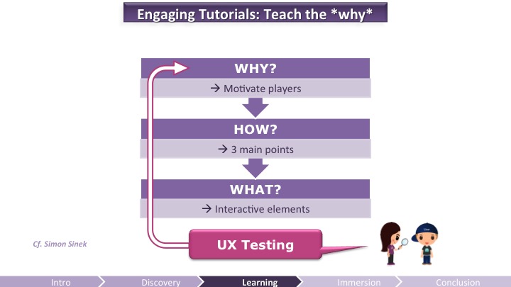
Think your onboarding and tutorial through the player’s lens: it’s more important to tease the player, give the why, rather than getting into too much details. If you motivate players enough, they will pay attention more on how to accomplish a certain goal. Then, when you ux-test your onboarding, check if players could figure out the why.
Here’s what I do for example: I show a screenshot of the game with the interactive element (example: something that players need to activate to do something). I ask them: what is this? How do you use it? Why is it important? I ask players what was the objectives of a mission, and what to do to win (instead of just asking if they found the objectives clear – as most participants reply that objectives are clear but then they have difficulties explaining what they are, which prove they didn’t really get it). Lastly, I ask them what was the purpose of completing the missions.
Always make sure that your players get the why for what you ask them to do.
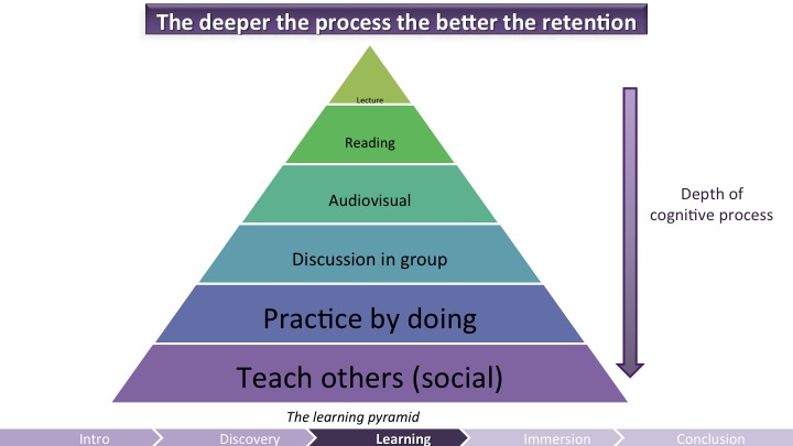
Remember that for all that you will teach, the deeper the process the better the retention. Numerous studies in psychology showed that learning is not simply a passive registration of information. Learning that “sticks” requires active, minds-on learning. Simply put, the more the brain puts efforts into something the more it remembers and understands it. Even then, however, your players will forget about stuff, so you need to be aware of how memory lapse happens.
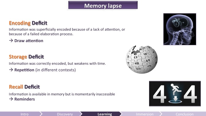
Memory allows to encode, store and retrieve/recall information. Thus, 3 factors can lead to oblivion:
- Encoding deficit: Information was superficially encoded because of a lack of attention, or because of a failed elaboration process.Workaround: Draw attention, make the player process, be emotional.
- Storage deficit: Information was correctly encoded, but weakens with time. Workaround: Repetitions (in different contexts).
- Recall deficit: Information is available in memory but is momentarily inaccessible. Workaround: Reminders.
Here are examples for each deficit.
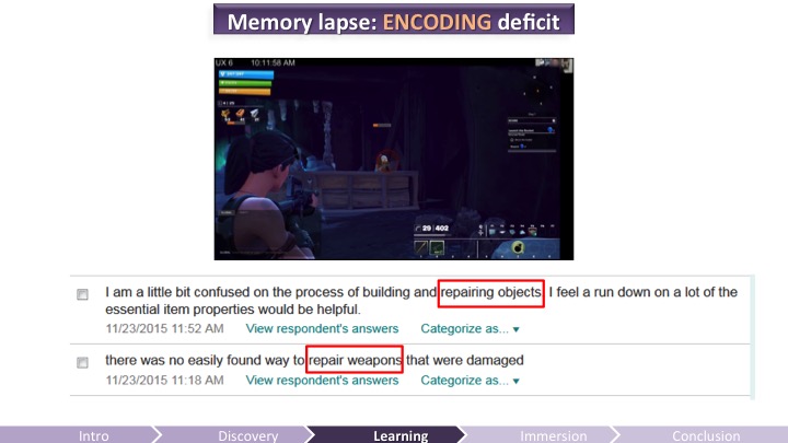
By design, you cannot repair weapons in Fortnite. Many players in the Alpha are asking how to repair weapons though, all the time. So the team decided to put the player in a situation when their weapon breaks right at the beginning of the game so we can tell them they can’t repair it that’s why they need to craft. The way it happens requires very shallow processing: the weapon breaks, a text pops-up and the narrator informs the player that they cannot repair weapons so they need to craft a new one. In the ux-test, we could see the players looking at the tutorial message and they do craft a new weapon. However, later during the day, some players were saying in the surveys that they didn’t find a way to repair weapons. The information had not been processed deeply enough, therefore if was not encoded.
Voice over information (VO) and a tutorial text only require a shallow processing from the player. They read the text, they probably heard the VO, but they didn’t really encode the information.
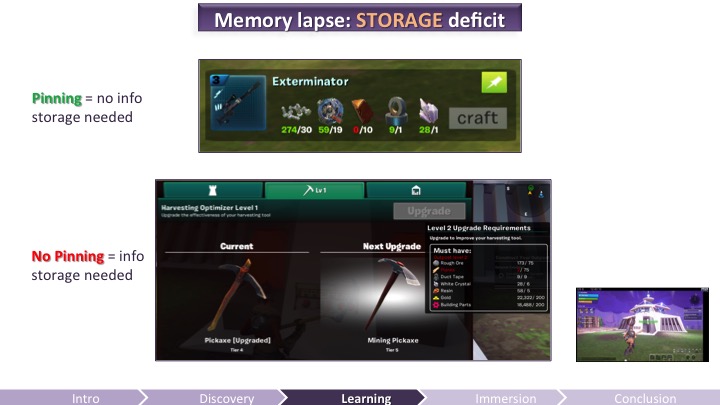
Pinning functionality allows the player to not store the info about what they need to craft but instead have this information on the HUD at all times. That’s a functional affordance which removes some memory load since players do not need to store that information in memory. When missing, players have difficulty storing the ingredients they need to harvest to craft something they want. The video was showing a very WIP-new-mission, with pinning not implemented yet, and the player had to go back many times to the physical panel to check how many wood planks he needed. He only had to remember one number (and refresh this number as he was harvesting). Yet he had to check the info 3 times within a very small time frame.
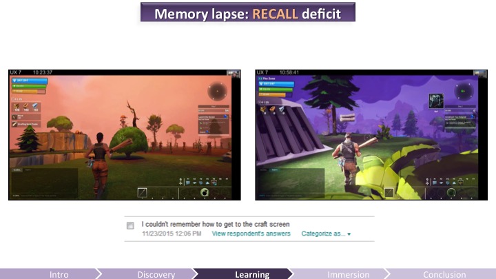
In the first “tutorial” level, we teach players how to craft in a deep way: they have to do it (learning by doing), which should ensure of a better retention. However, in the next level (about 20 minutes later), one player could not remember how to go to the craft screen when he needed to craft weapons before an attack. He knew he could do it, but he couldn’t remember how, as we can see in his survey answer. We should have given a recall hint to help him remember how to craft.
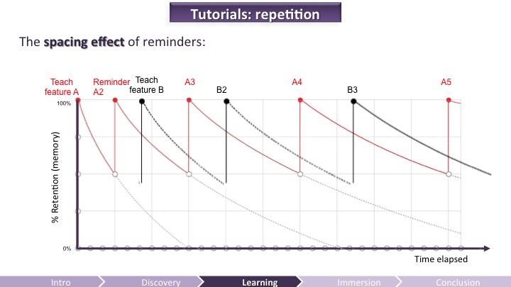
We saw that repetition is important. Remember the forgetting curve? To help players reinforce in memory what they are learning you will need to give them multiple reminders depending on how new and complex your mechanics are. It’s important to use repetition, but you should not do it at regular intervals, use the spacing effect instead.
Reminders are more efficient when spaced out, but also when the context does not stay the same. For example, to teach your players how to use a new weapon, first teach how to shoot still targets, then moving targets, then partly occluded targets, then moving targets while dodging, etc.
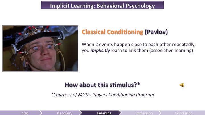
We talked a lot about cognitive psychology and active learning principles. Let’s briefly tackle behavioral psychology to give you an idea of how you can use it. We’re talking classical conditioning here: It’s when two events happen close to each other repeatedly (e.g. “a bell” then “food”). You implicitly learn to link them (associative learning).
How about the Metal Gear Solid alert SFX? Feeling conditioned? 😉
Other examples of classical conditioning: music stops when no more enemies left to kill. Conditioning can be used to teach some mechanics. It can work very well, especially by associating sound with another event, so be nice to your sound designers.

To truly immerse your audience, beyond removing the barriers, you need to mind the gameflow (never too easy nor too hard), the emotions (including the gamefeel), and motivation. Here I’ll only talk about motivation since game studios are increasingly interested in motivation mechanisms in psychology.
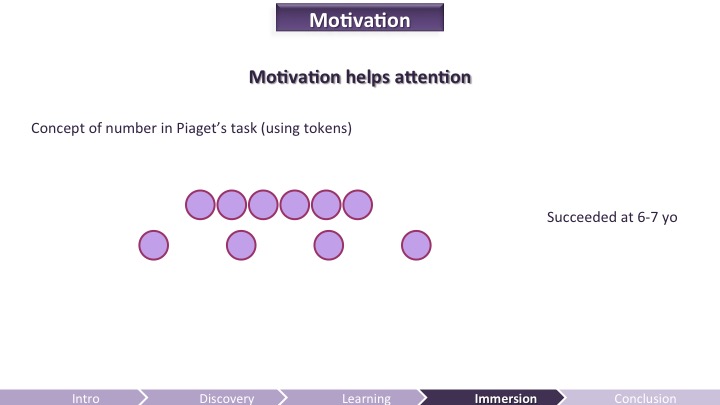
Jean Piaget was a developmental psychologist: he was interested in discovering how children develop cognitive skills, such as the concept of number. To find out, he developed a number of tasks such as the one shown above. He would show the children 2 lines of candies; one compressed with more candies and one more spaced out but with less candies. Then he asked the children which line had more candies. He found out that until 6-7 years old, the children would answer that the bottom line was the one with more candies because “it is longer”. Therefore, Piaget concluded that children are “tricked” by their perception and did not have a true cognitive understanding of numbers until 6 years old (c.f. Piaget et Szeminska 1941; 1967).
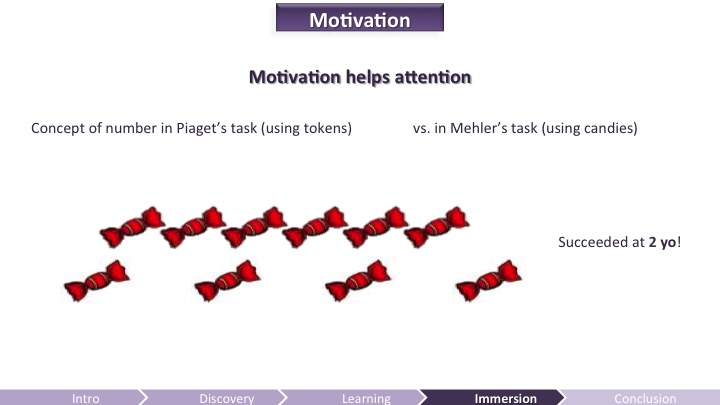
Until another psychologist, Mehler (1967), tweaked the task a little bit: he replaced tokens by candies and asked the children which row has more candies, mentioning to the kids that they could take that row for themselves. Surprise! In this condition, the children solve the task as soon as 2 years old… Motivation is important, not only because it helps engagement, but also because it helps to focus attention, solve a task, and therefore remember elements better.
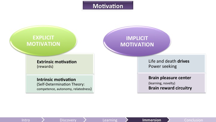
Player’s engagement is typically driven by extrinsic motivation (Ryan & Deci, 2000). Players want to achieve external rewards and avoid the opposite (typically the absence of reward). Intrinsic motivation is however even more powerful for long-term engagement: research seem to indicate that games that satisfy basic psychological needs for competence, autonomy, and relatedness (the Self-Determination Theory) will more likely be engaging. People – and players (c.f. Przybylski et al., 2010) – are driven by an increase of their competence (sense of progression), autonomy (meaningful choices and self-expression) and relatedness (social aspect). Intrinsically motivating experiences are known to be deeply engaging for children and adults alike, as in the experience of “flow”, in which a person loses his or her sense of time while engaged in an activity.
But there’s also the implicit motivation, our dirty little secrets such as life and death drives and power seeking. You surely also have heard of the brain pleasure center, triggered by learning and novelty among other things and the brain reward circuitry (well-known by casinos). Motivation mechanisms are complex and we are just scratching the surface of it.
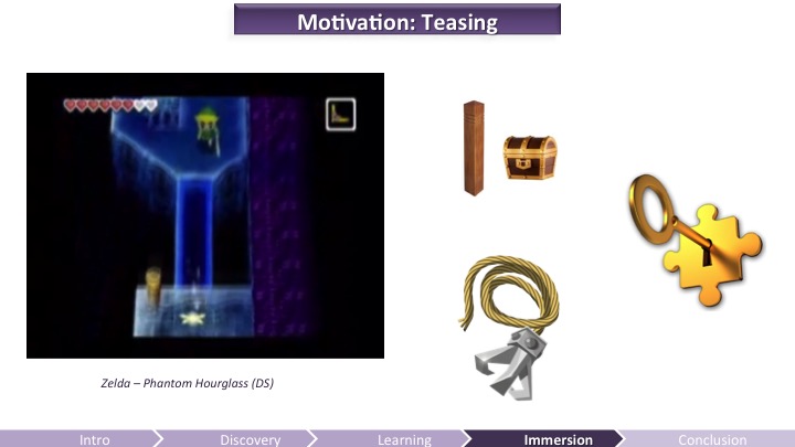
It’s more motivating to get a meaningful reward than just a pat on the back, or to unlock an out-of-context achievement (tutorial completed! Congratz!). In Zelda Phantom Hourglass, the player starts to discover poles without knowing what it is. Then more poles, even next to unreachable chests… Until the player receives the grappling hook… Eureka! This reward becomes intrinsically motivating because the player already understands how to use it. This smart way to tease with locks before giving access to keys is a way to motivate the players intrinsically and meaningfully.
Show the locks before giving the keys. The locks will tease and motivate the players to figure it out, give them agency, then once they get they key it will feel much more rewarding, because more meaningful and intrinsic.
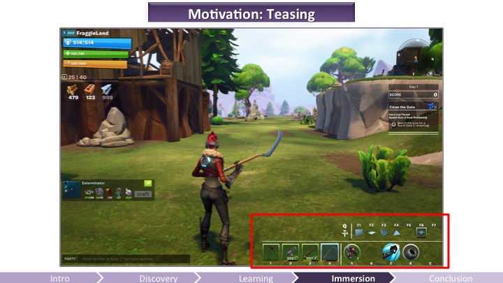
Here’s another way you can simply tease players. Let’s take a look at Fortnite’s HUD.

The older HUD (a year ago) had not segmentation and the players could rearrange their weapons, abilities, gadgets, however they wanted. The problem is that it was a big mess and very rarely did we see players in ux-tests using their cool new gadget or ability they had just unlocked. Wtf?
Today, it’s segmented: separating the harvesting tool, from weapons, from gadgets, from abilities. This made it clearer to the player when they got a new ability or gadget: in ux tests we now observe them using gadgets and abilities much more. Just because it’s clearer to see it’s there.
Seeing empty slots also teases the player that they can get more if they progress in the game.
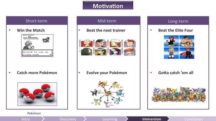
To get engagement and long-term motivation, you need depth. Here’s an example of short, mid, long term goals for intrinsic motivation in Pokémon.
These must be perceptible by the players. You must find a way to express the progression path for short, mid, and long term without being overwhelming. You want to show depth without being too complex.

Lastly, I’d like to do a quick digression on the social impact on learning. Humans are highly social creatures, this is how we got to survive. Overwhelmingly, research in education has found that cooperative and collaborative learning environments are optimal (Johnson & Johnson 2009).
So games in general and multiplayer games in particular can benefit from social learning. Simply having a social partner is not enough though. The social interaction has to be of a high enough quality that it does not detract from the learning situation. Meaningful mentorship, such as Eve Online‘s and TF2‘s is a good example of deep social interaction. So think about how you can meaningfully enable social learning in your game, or even outside your game (after all, social learning with Minecraft happens mainly outside of the game, on Youtube and Twitch).
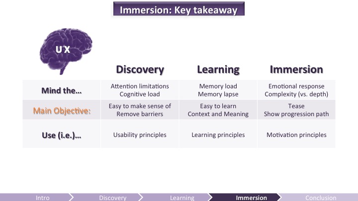

Let’s wrap this up!
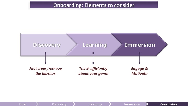
Research in Science of Learning research suggests that there are 3 kinds of engagement (Frericks, Blumfeld, and Paris, 2004):
- Behavioral engagement (i.e. following the rules and instructions) – which in our case is very close from removing the barriers by making sure the game is usable.
- Cognitive engagement (investment in learning, flexibility in problem solving).
- Emotional engagement (affective reactions, which is at the core of motivation).
Each type of engagement is critical for learning because they all foster staying on task (staying engaged). That’s why you need to keep in mind these elements.
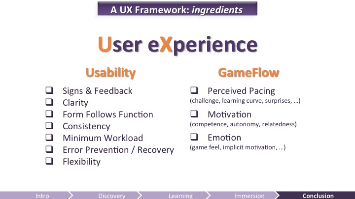
As always, also keep in mind limitations of the brain and use UX guidelines as a checklist.
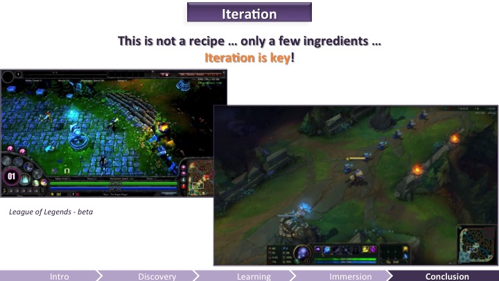
Sadly, all this knowledge will only get you that far. What we saw are ingredients, it’s not the recipe. The recipe, this is what you have to figure out by tweaking the ingredients. Supercell recently said in an interview that it killed 14 games before it was able to successfully launch its fourth game, Clash Royale.
The pictures above are taken from a video showing League of Legends evolution (Polygon) from Beta to the current game. Riot has a big kickass UX team, they still need to iterate the hell out of their game.
At least, with these ingredients, you will save time and have the right mindset to progress faster through your iterations. So good luck!
I’d like to warmly thank the Fortnite and Paragon team for letting me show their rough designs and artwork. Special thank to Pete Ellis, Art Director on Fortnite who I know is dying a little bit inside each time I’m showing early artwork yet lets me do it. 🙂
Pingback: GDC 2016 Presentations | Krzysztof Narkowicz
Pingback: GDC 2016: Lisa’s Favorite Talks | Lisa Brown