GDC Europe 2014 / MIGS 2014 talk
I’m sharing here my slides from my GDC Europe 2014 presentation, which I also gave at MIGS 2014 (How we are using UX Practices on Fortnite). Since I didn’t find any good slide sharing plugin (speaking of bad UX…) I just added all the slides in jpeg and put my speaker notes below. 😉
The content of this presentation is a mix of academic theories, Ubisoft Design Academy training about usability, and my own experience interacting with game teams. The following is certainly not set in stone – it’s a constant work in progress – and I’d be very interested to get your feedback.
This is an exciting time for the psychology in games, since the experience of the player is now truly recognized. More studios are becoming user-centered and want to bring a great experience to their audience.
But what is UX exactly? And how to do it right?
When I started at Epic Games, there were no UX practices, no tools. So the very first challenge I had was to explain what UX is about, then start using UX practices on Fortnite, so this is what I propose to talk about today. I needed to first establish a UX model for the studio, and then apply it in different ways (through prototyping and playtesting mainly). So that’s why I’m presenting that model to you today, and I’ll give a few examples from Fortnite.
I’d like to thank the Fortnite team for letting me show our iterative process, for a game not even released and still very early in its development stage.
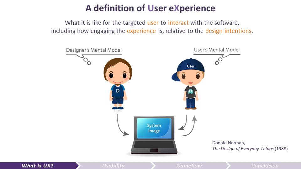
This definition of UX is a tweak from the Ibister and Schaffer’s definition from the book Game Usability (2008). Why is UX important? Because the designers of the game don’t necessarily have the same mental model as the users. The use of mental models was popularized in the Human-Computer Interaction (HCI) community by Donald Norman in his book The Design of Everyday Things (1988). First, a system is designed and implemented on the basis of the designer’s mental model. Then the users come with their own prior knowledge and expectations, and develop a mental model of how *they* think the system works through their interaction with it.
So UX is all about making sure that your user is going to experience the game the way you, as a designer, intended. You want the system image to convey truthfully the experience you want to offer.
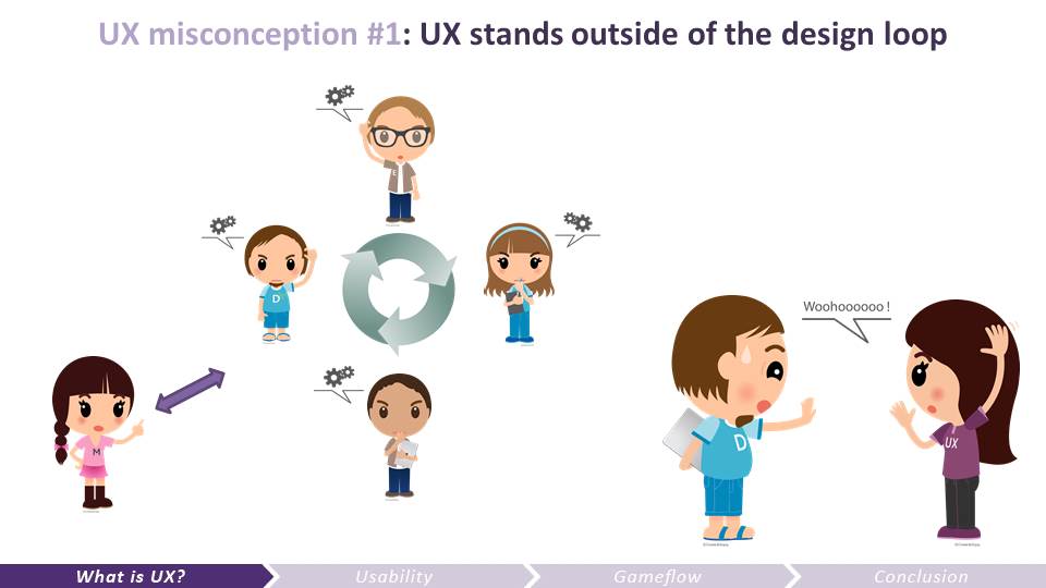
1 – Designers, artists, engineers design, debate, iterate based on their opinions, experience, gut feelings
2 – Marketing gives input on market and audience (execs – business strategy)
3 – Designers and engineers keep making decisions within a closed circle…
4 – UX peeps try to draw attention when there’s such department indoors: “hey, how about we try out features to help you make design decisions?”
5 – Core team: “IT’S NOT READY YET!!! Go away!!”
6 – Eventually, the features get tested, but late in the process, when changes are very costly, not always easy to do, time is lacking, and so only patches can be done.
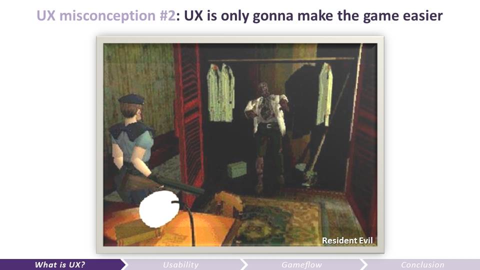
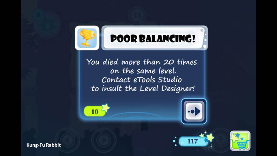
Another big misconception UX people have to face in the industry is that the dev team usually believes UX is gonna make the game easier. Or distort the game design intentions.
Let’s say you’re a UX researcher and you’re testing a game like Resident Evil and see this happening: the player opens the closet, a zombie comes out of it. Out of panic, the player moves backward but is blocked by the table left here by the vicious level designer. Some player dies, and all seem frustrated by this. If UX researchers tell the dev team to remove the table to avoid player’s frustration then they are ignoring the experience intended: fear, panic.
Also, if you completely forget about the targeted audience, the “user”, then games like Dark Souls couldn’t exist. It’s designed for hardcore players who like to suffer and beat a very challenging and unforgiving game.
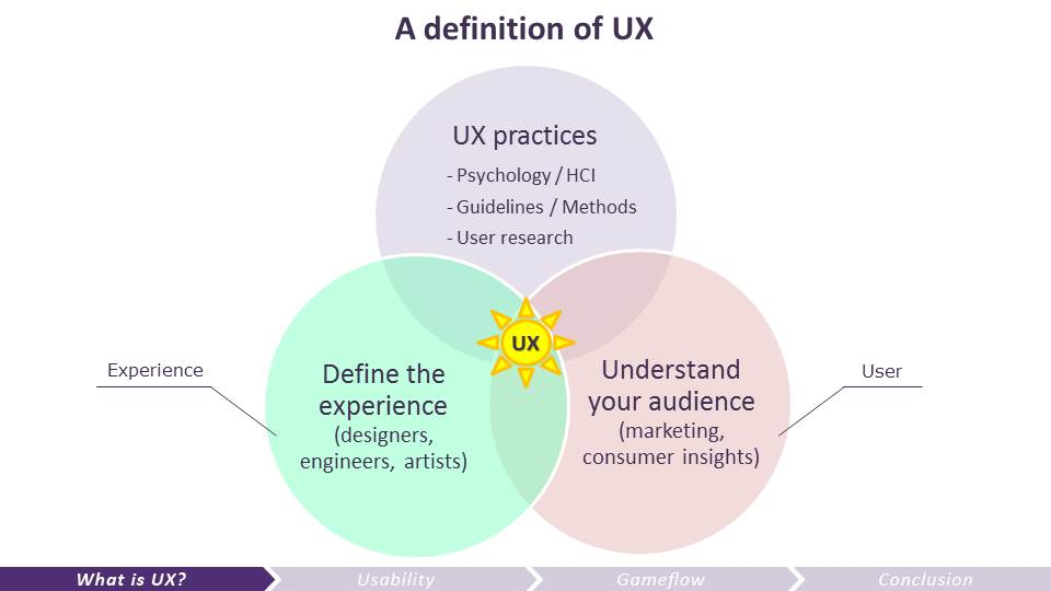
To complete the definition of UX, to me UX is at the intersection of 3 disciplines:
- Design, who defines the experience.
- Marketing / Business Intelligence who define the target and give input on the audience expectations and needs.
- UX specialists who verify that the experience designed will be and is the one experienced by the target audience.
To have a great experience, UX should be a concern of everyone, not just the concern of a separate team. But if you have such a team in your studio, it’s very important that they work closely with the dev team and the marketing team very early in the development of the game.
This is all very cute, but not very practical.. How to break down UX to measure it and improve it?
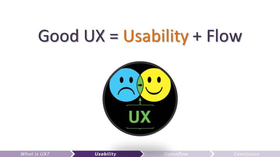
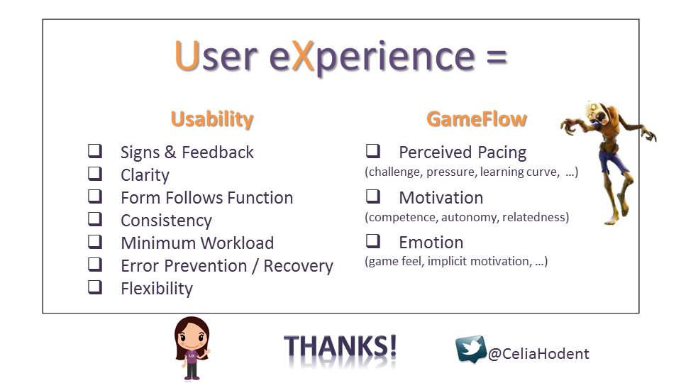
The way I break down UX to evaluate it and measure is like this:
- How usable the game is?
- Can the player reach a state of flow while playing it?
And this is the model I’m using to help the Fortnite team. Talking about games here but the same principles apply to software.

Since usability is about brain limitations, let’s talk a little bit about the brain, with regard to perception, attention and memory.
Isbister , K. , & Schaffer , N. (2008). What is usability and why should I care? Introduction . In K. Ibister & N. Schaff er (Eds.), Game Usability. Burlington, MA: Elsevier.
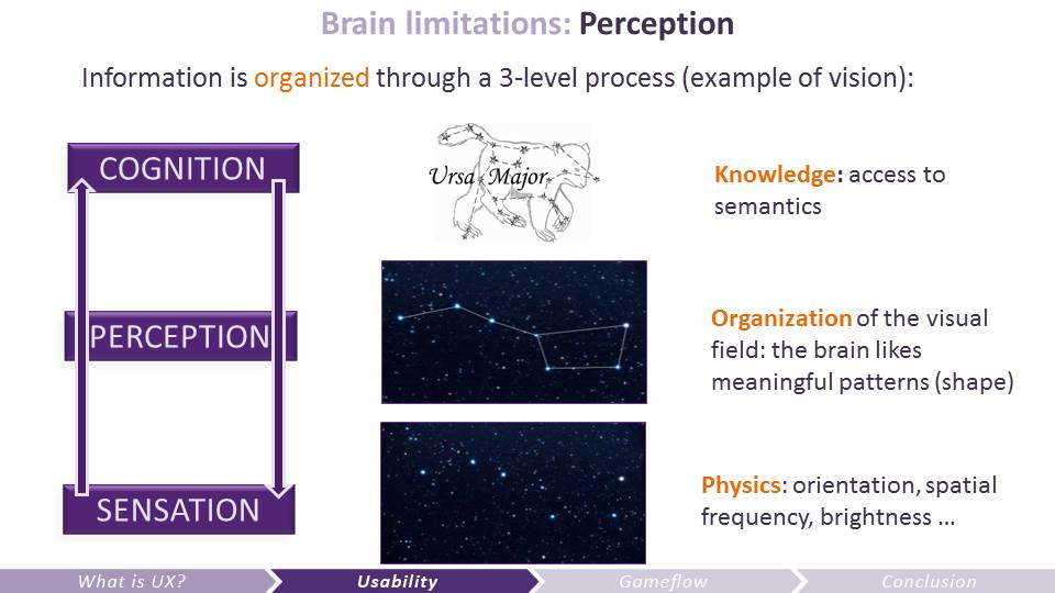 Perception is not a passive window to the world.
The process can be bottom-up (sensation – perception – cognition) but it actually is top-down very often: your knowledge influences the way you perceive things (this principle is at the basis of Gestalt theory of perception).
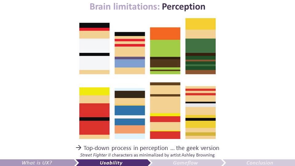 Is this meaningful to you? (original Street Fighter II characters as minimalized by artist Ashley Browning)
People who don’t know about Street Fighter might just see color stripes here. If you’re a big fan of the game, you might see something different.
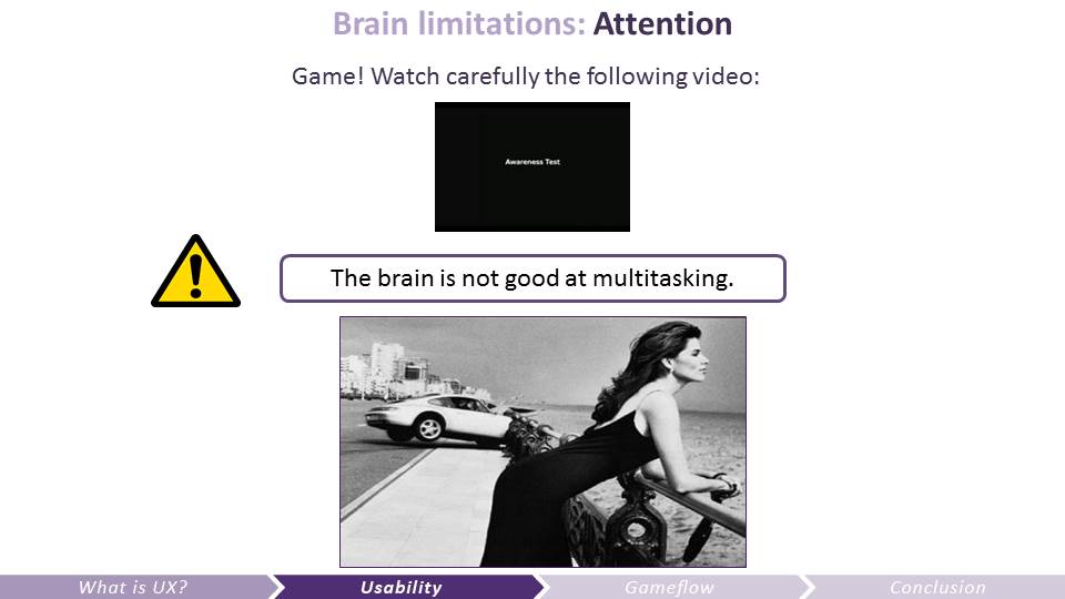 The brain has lousy attentional resources. Watch the Awareness test video here: https://www.youtube.com/watch?v=KB_lTKZm1Ts
The brain is not good at multitasking. When focused on a task (say, shoot zombies in a game) we cannot focus on anything else (say, important UI that just pops-up)
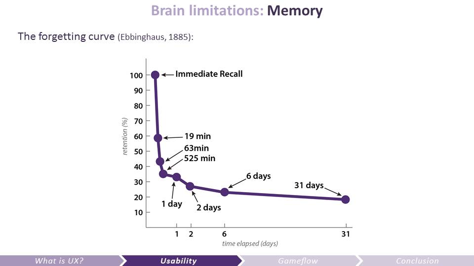
In 1885, Hermann Ebbinghaus, a German psychologist, demonstrated the exponential nature of forgetting.
All of these limitations make usability something difficult to achieve, and they explain the guidelines (heuristics) that have been developed. And which we’re gonna talk about now
“Memory: A Contribution to Experimental Psychology — Ebbinghaus (1885/1913)”. Retrieved 2007-08-23.
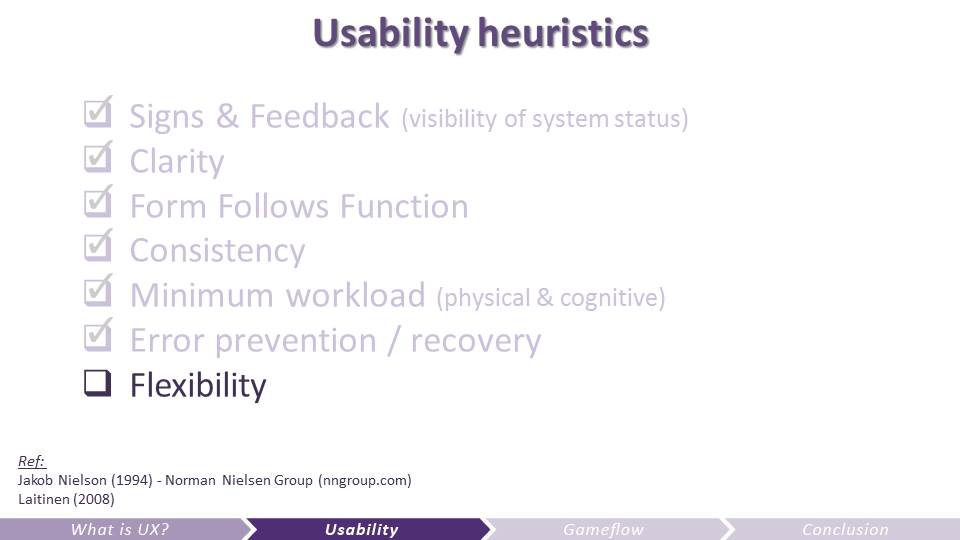
 The following are the guidelines I use the most to evaluate games usability. And which I’m using on Fortnite and encourage the team to use when they are evaluating their game. There are many heuristics out there, so this is no revolution, but merely my attempt to boil it down to a small comprehensive and concrete list.
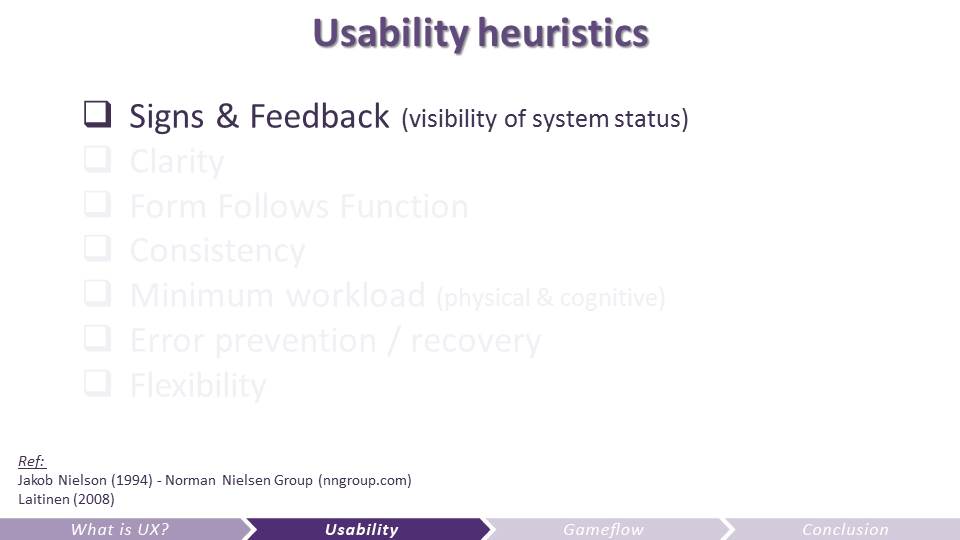 Signs and Feedback = give meaningful information about the system
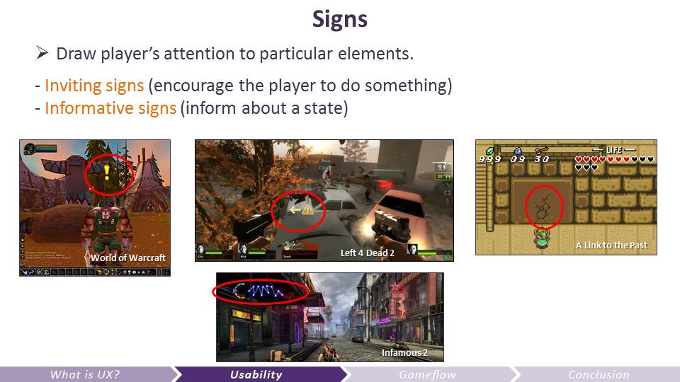 There are 2 types of signs: inviting signs that should draw attention to guide the players, and informative signs that should be legible but not draw attention too much (unless the player reaches a critical state, such as low health).
Inviting signs can sometimes be more subtle (such as in the Zelda example) if the intent is to make the player feel discovery.
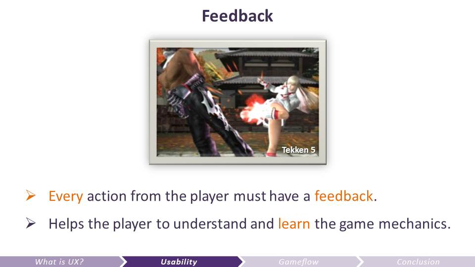 Think about when you take the elevator: pressing button of the floor, if no feedback, you mash the button, as you’re not sure if the system knows about your intention – frustrating
Side note: be careful about what I call the red overload.
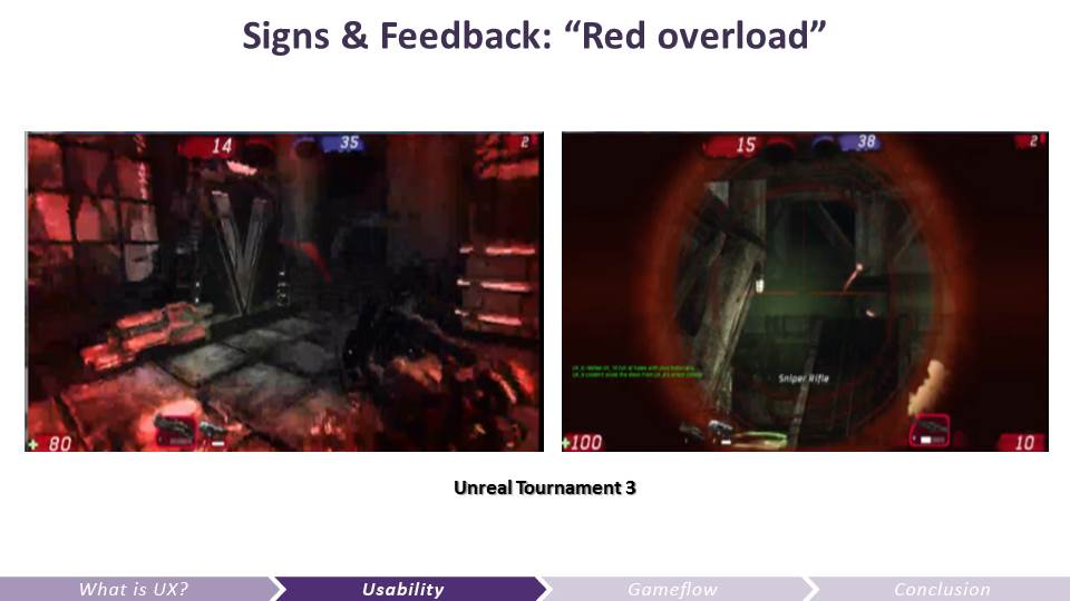 Red overload: here I’m gonna take an example from UT3 since it’s more obvious.
The reason why red is a good color for damage and threat is that it’s an easy to spot colour, and it’s the colour of the blood. However, some games have a tendency to have a lot of red signs and feedback for minor notifications. Also, in red\blue PvP games, the red team see allies in red and enemies in blue, which is actually more demanding in terms of attentional resources.
Overall, I usually suggest to dedicate red for immediate threats and when taking damage. I recommend using orange for enemy names or health bars and green for player’s health. We initially had a red health bar in Fortnite, and although I understand many games use red for health, when you do that, you are making the red feedback on damage less visible.
 Clarity – it’s all about how the UI – and all the information conveyed – will be perceived by your player. Is it clear enough?
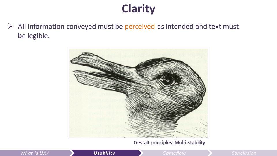
- Clarity: all info conveyed must be perceived as intended (symbols) and the text must be legible. Everything is important: from the text font, size, color, contrast, to all other information in your HUD: organization, hierarchy, context, iconography…
- Use the Gestalt laws.
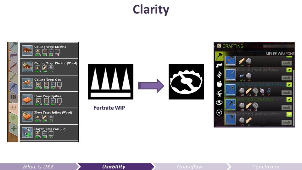 Let’s take an example from Fortnite (action building game with RPG elements). In that game, among other things (like shooting zombies called husks) you gather resources to craft and build stuff. This is an icon that was illustrating a category of items in your inventory. Can you tell what it represents? What about this one?
The spike icons were not at all identified by players as a trap icon, even after playing and seeing the shape of the traps in game. We replaced it by a more stereotypical trap icon (even though old..) and now all players get it.
 Consistency: controls, UI, signs and feedback must be consistent as much as possible, or else it can be confusing, frustrating, or at the very least the user will have to re-learn about a behavior.
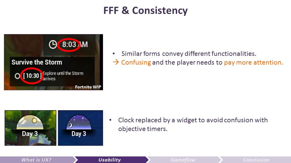
Beware though; consistency is not usually a good thing across different functionalities. For one form there should be one function only.
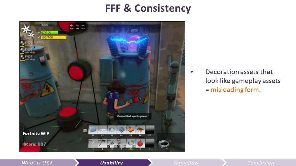 This is an example when art can impair the experience of the player because it’s breaking consistency. In a specific Fortnite game mode we were testing early on, players had to connect a generator to a machine to power it up.
However, there was a decoration asset in the game rich in details (electrical sparks) that were actually impairing the experience of the players because they thought it was the generator they were looking for in their current objectives. This is a case of false affordance: players believe an object has a specific gameplay functionality, only to be deceived.
 Minimum workload: physical (how many buttons you need to press to change a weapon for example), cognitive (memory, working memory, etc.).
If the workload is not by design (e.g. Diner Dash is about time management, and the challenge is all about reaching the player’s limit in working memory), it’s better to avoid it so the players can really put effort in what matters most for your game.
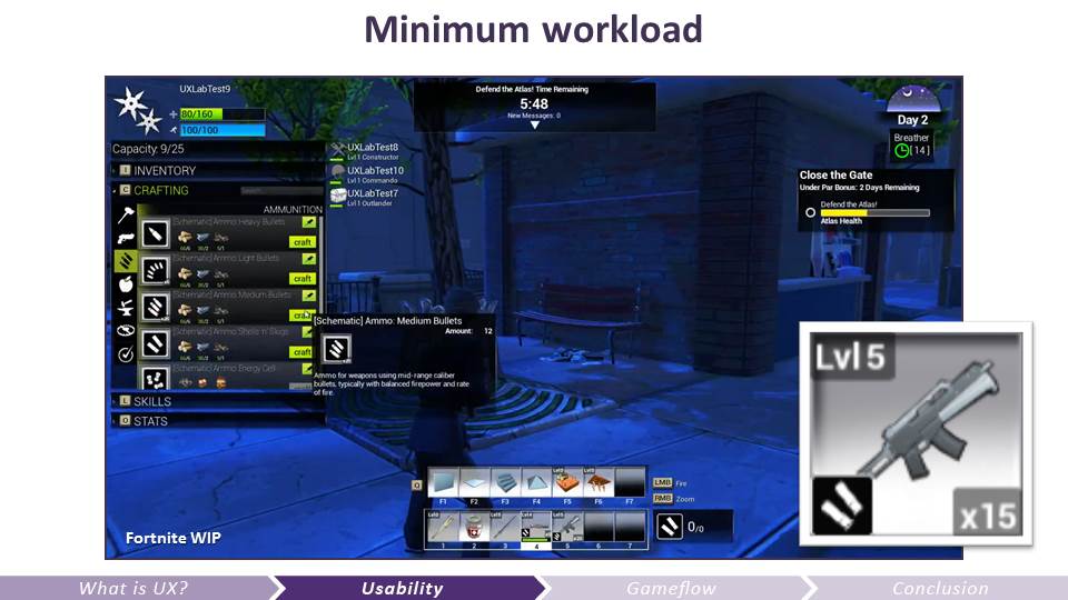 Example from Fortnite: In order to constrain the number of ammunition types in the world, we needed to find an easy way to convey which ammo goes to which gun, and it was very difficult for the players to remember that info. It was a huge problem since the players use resources to craft ammo.
Solution: on the gun icon the ammo type is represented. This is preventing the players from remembering which ammo they need, they simply have to look at the icon next to the gun they have equipped. This is an example where recognition is used rather than recall. Players don’t have to remember that information.
 Be generous and help the players to prevent or easily recover from errors, again if this is not central in your experience.
 Flexibility: players can customize everything (controls & UI, camera, help…)
This is also very important for accessibility – so players with disabilities can adapt the UI, controls the way they feel most comfortable.
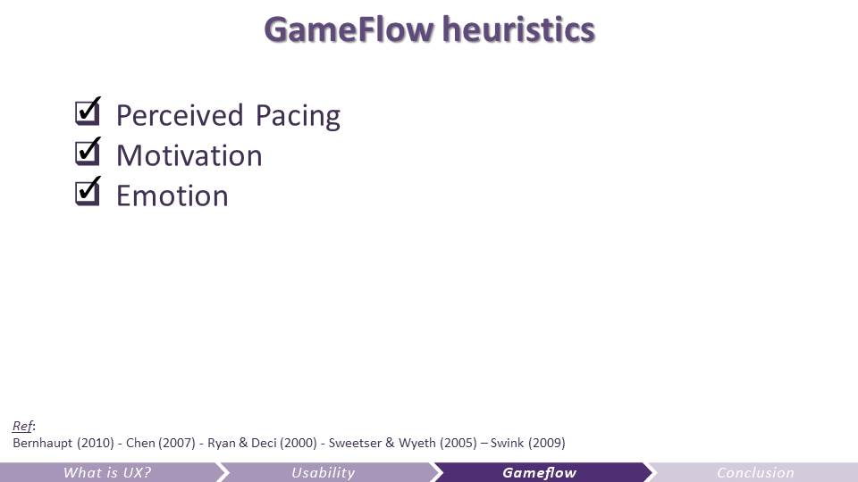
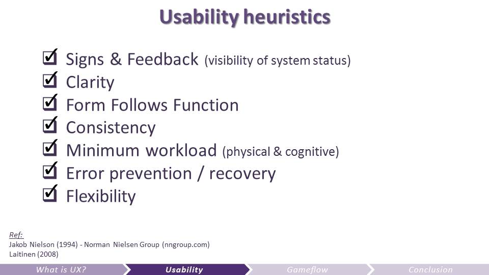 This is it! The 7 heuristics I’m using the most to assess the usability of a game.
We certainly haven’t checked these all on Fortnite. Because it’s complexe and it takes time, and we’re still very early in the development cycle. But the earlier you can tackle this, the faster each iteration will take, and the better your game will be. The more you can anticipate these problems before you implement features in your game, the better. So don’t hesitate to paper prototype and test everything you can!
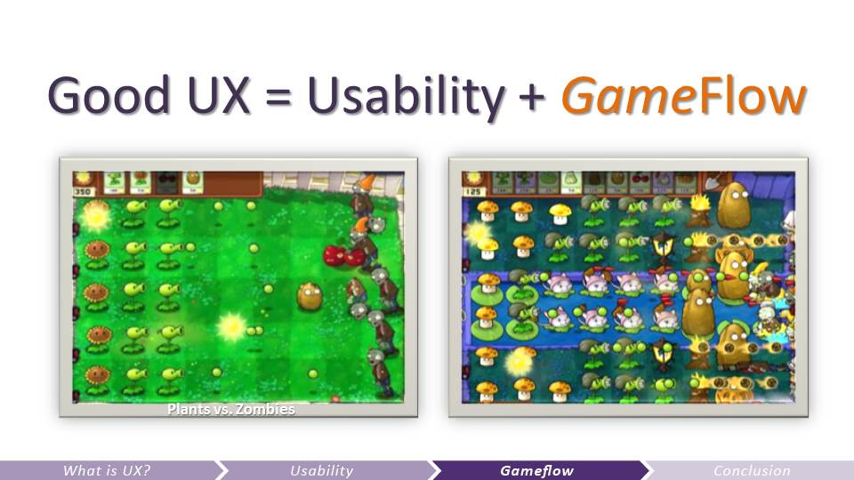 PvZ is a great example for GameFlow: it’s easy to learn and can be hard to master

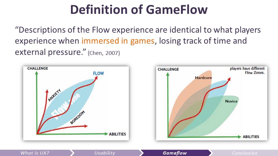 This is how we can use the concept of flow for games (or software).
This is harder to anticipate and test than the usability part, yet it’s crucial. Although a usable game has less chances to suck, it won’t necessarily be great either. Reaching a good flow for the game is what can make it great. Usability is the first step, and without it the flow part is gonna be even harder to accomplish. But ultimately, players want to have fun, and this is what gameflow is all about.
http://www.jenovachen.com/flowingames/p31-chen.pdf
 I apologize, I don’t have enough time to develop each gameflow heuristics, but at least it should give you an idea of how I’m trying to tackle this difficult challenge with game teams.
 A lot of these things are difficult to assess early on, and this is why refining the balance of the game is crucial in beta stage.
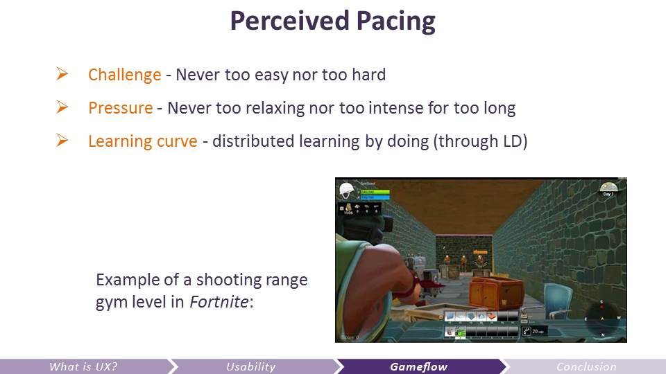
However, this is an example of what you can test. The Fortnite Animation team was wondering what was causing aiming issues, as some players were having difficulties to target enemies. To test this problem, we created a gym level about a shooting range. Players had to do as many headshots as they could within one minute. Zombies were constantly spawning.
This is how we saw that the problem was not an animation one, nor a character design one, but due to the pathing code (rotational value = doing instantaneous turn, instead of soft blend). In fact, players only had difficulties aiming at enemies when they were sharply going around an obstacle. So this is what we needed to fix first.
 Motivation is key to have players enjoy your game. It’s a complex topic though.
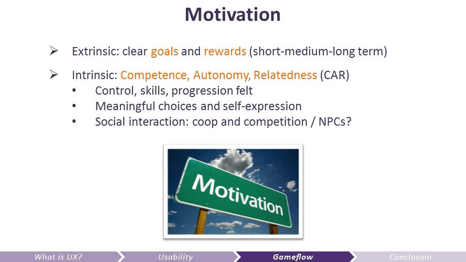 The model I use for intrinsic motivation is the SDT: Self-Determination in Human Behavior (Perspectives in Social Psychology) – Deci and Ryan (1985)
Ensuring that your game offers competence, autonomy, and relatedness is crucial to flow.
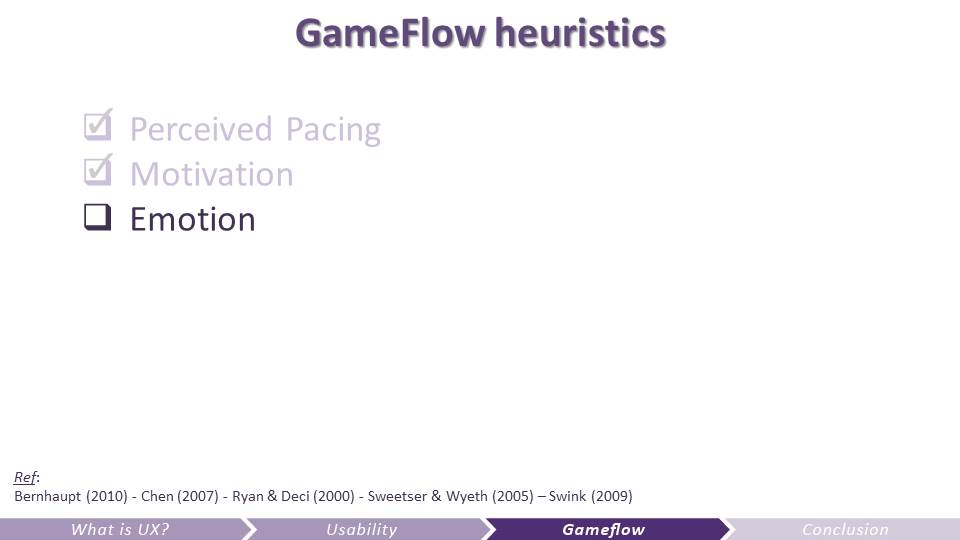 The brain is not rational, it’s emotional.
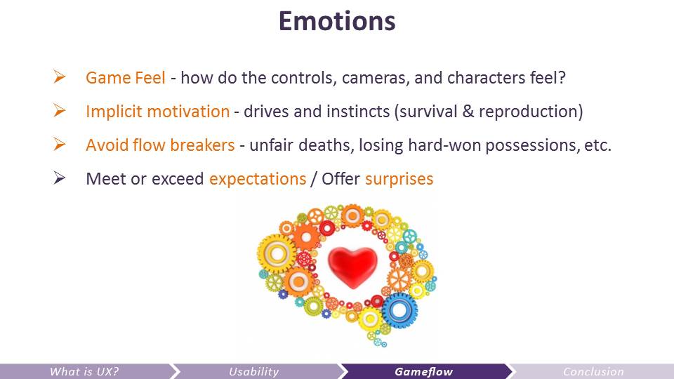 Elicit emotions…
Bernhaupt , R. (2010). User experience evaluation in entertainment . In R. Bernhaupt (Ed.), Evaluating user experience in games . London, UK : Springer-Verlag
Chen , J. (2007). Flow in games (and everything else ). Communication of the ACM , 50 , 31–34
Ryan , R. M. , & Deci , E. L. (2000). Self-determination theory and the facilitation of intrinsic motivation, social development, and well-being . American Psychologist , 55 , 141–166
Sweetser , P. & Wyeth , P. (2005). GameFlow: A model for evaluating player enjoyment in games. ACM Computers in Entertainment , 3 , 1–24 .
Swink, S. (2009). Game Feel: A Game Designer’s Guide to Virtual Sensation. Burlington: Elsevier.
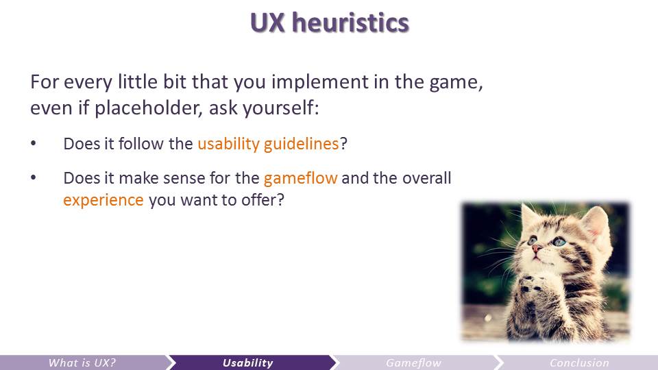 Yes, I totally put a cute picture of a cat here so you’ll associate UX practices with a positive emotional response… :p
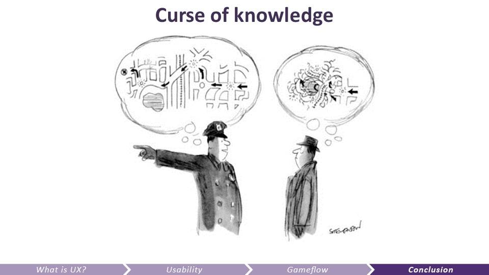 Among all the good reasons why we need to understand the user’s brain better, and why we need to use these heuristics when developing a game is mainly because of the curse of knowledge.
It’s when you know something so well that it gets super confusing to someone new who has a fresh and different perspective. This is where UX practices becomes your BFF. To help you take a step back from your design, get away from your perspective and adopt the user’s.
 Cf. Simon Sinek
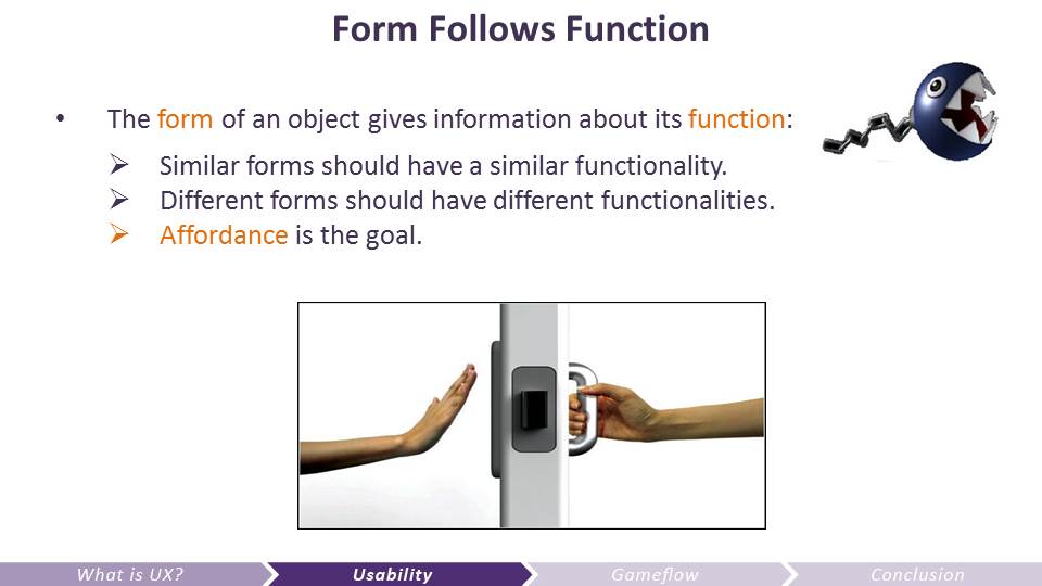
Whenever you have an engineering problem to solve or a feature to add, you must ask yourself why is this gonna be important to the user for the experience intended. Then define the functions of that feature. Lastly, choose the form that will convey the meaning and the functions to the user. Also, whenever UX researchers or other developers give feedback on that feature, it also has to be through UX lense, and we, as developers, must step away from mere opinions.
This can be done at any stage of the development process. With or without at lab.
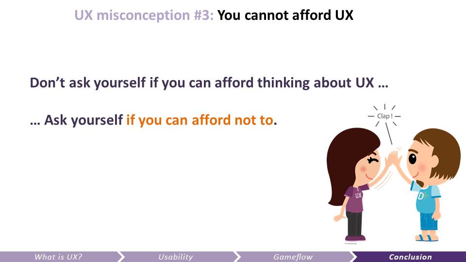 Even if you cannot afford a psychologist, user-researchers, or a fancy lab, you can make sure you regularly adopt your audience’s perspective, and test your design with people around you that don’t know about it, using the checklist model that I just described. It will help you find problems way sooner, so you’ll iterate faster and better, and your game will have more chances to delight your audience (therefore to make more money) by providing a great experience.
To me, UX is a philosophy more than anything else, it’s all about shifting from our ego-centered perspective by using a scientific approach, it’s about having empathy for our audience, and being generous.
Pingback: Why Your Idea Might Not Make It Into UE4 – Headcrash Industries
Pingback: 5 Misconceptions about User Experience - Celia Hodent